2023 Web Design Trends

Another year has flown by and we’re back in January again! Which means it’s time to have a look at what has been popular, and what will be making an impact in the upcoming months, in the world of web design.
Motion Design
Life in 2023 is always on the move, and this includes how we digest digital content. Whereas social media used to be Facebook posts and Instagram photos, these days it’s Insta reels and Tiktoks. On the whole, users are comfortable with the constant animation style of content delivery that has become the norm, and this is being reflected in web design.
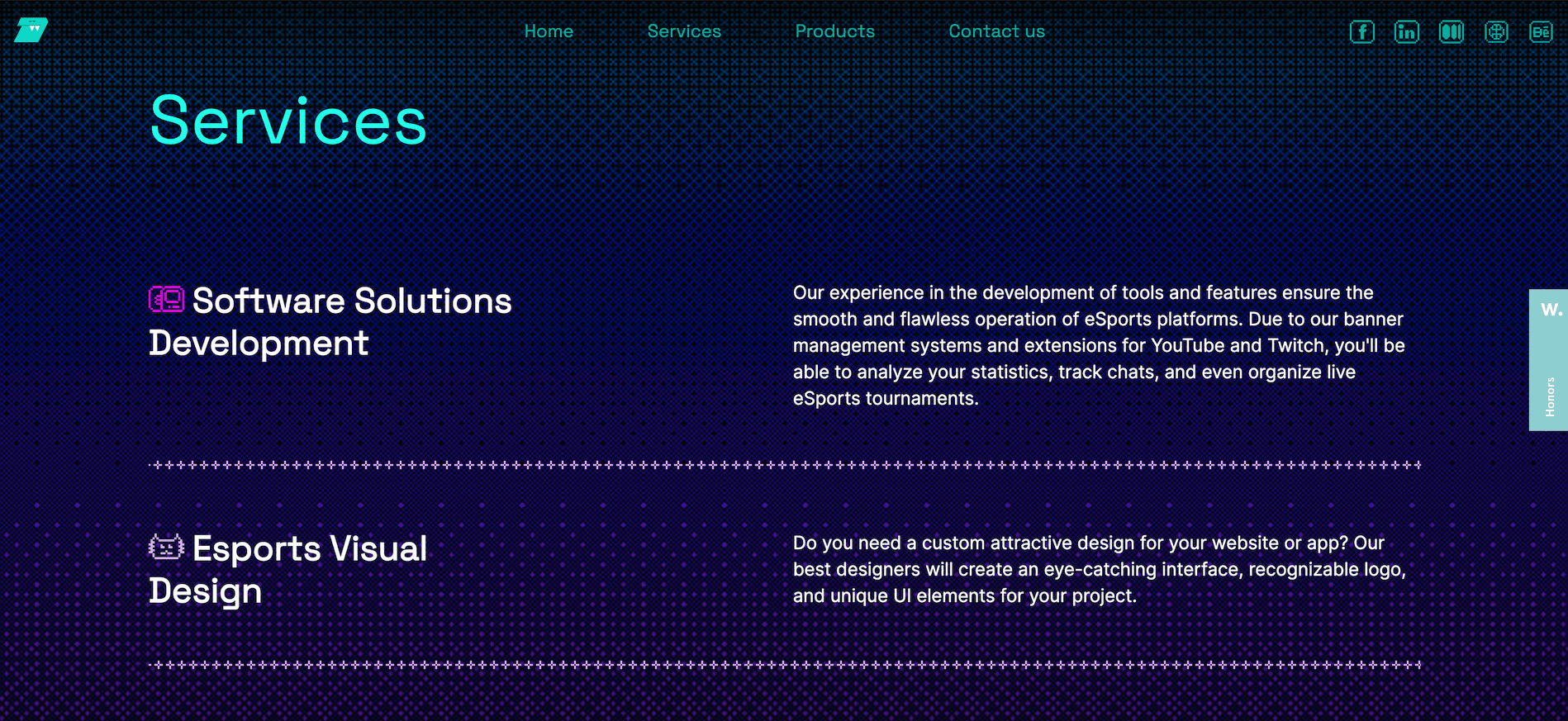
It’s unusual to visit any website these days and not find at least a hint of animation; loading content in, hover states, user interactions – everything moves, and making this happen is becoming a key task in the design process.
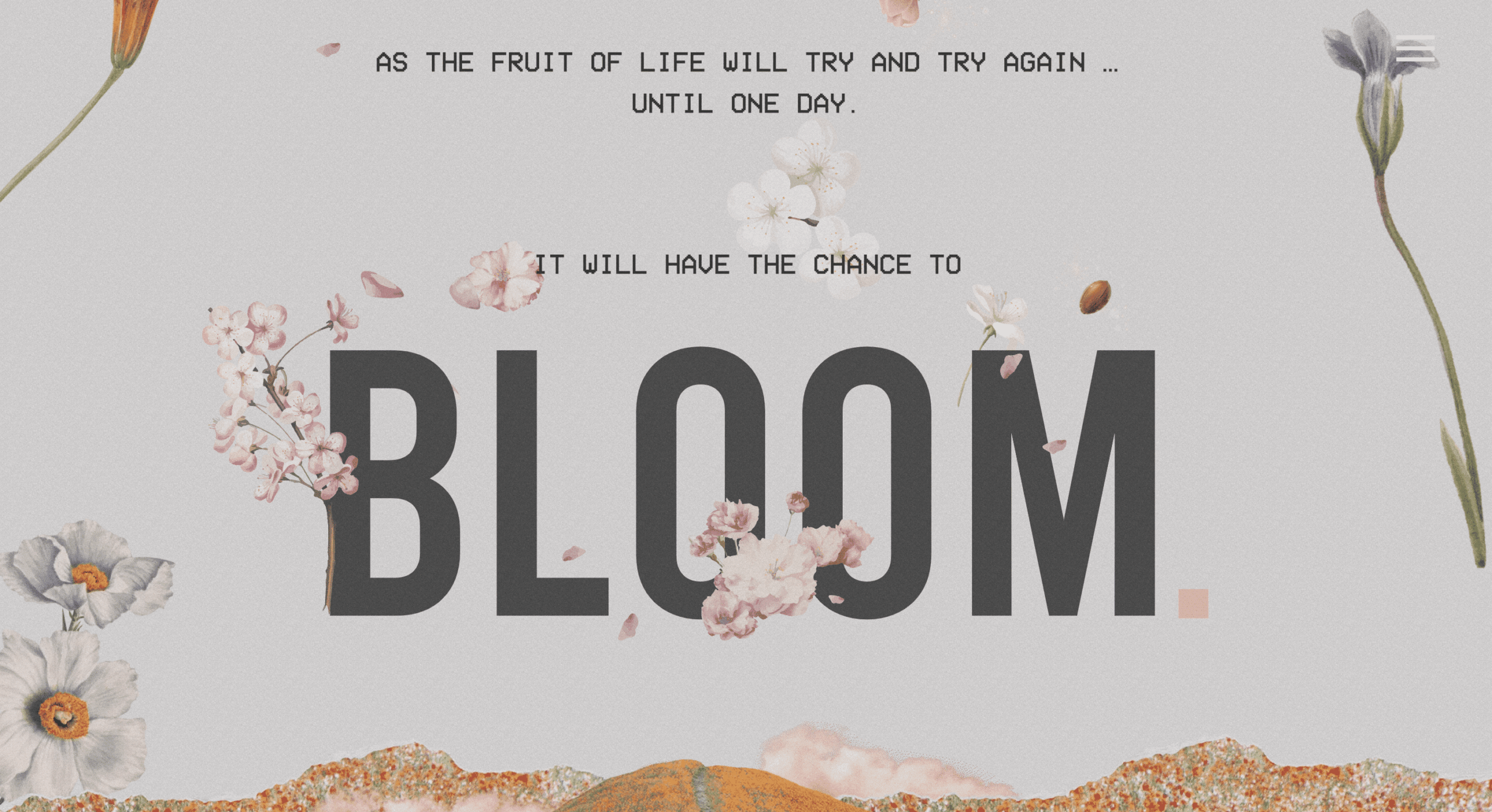
The Bloom website has used the flowery theme linked to their name to create a lovely animated experience scrolling through the site, without impacting the content they are delivering.
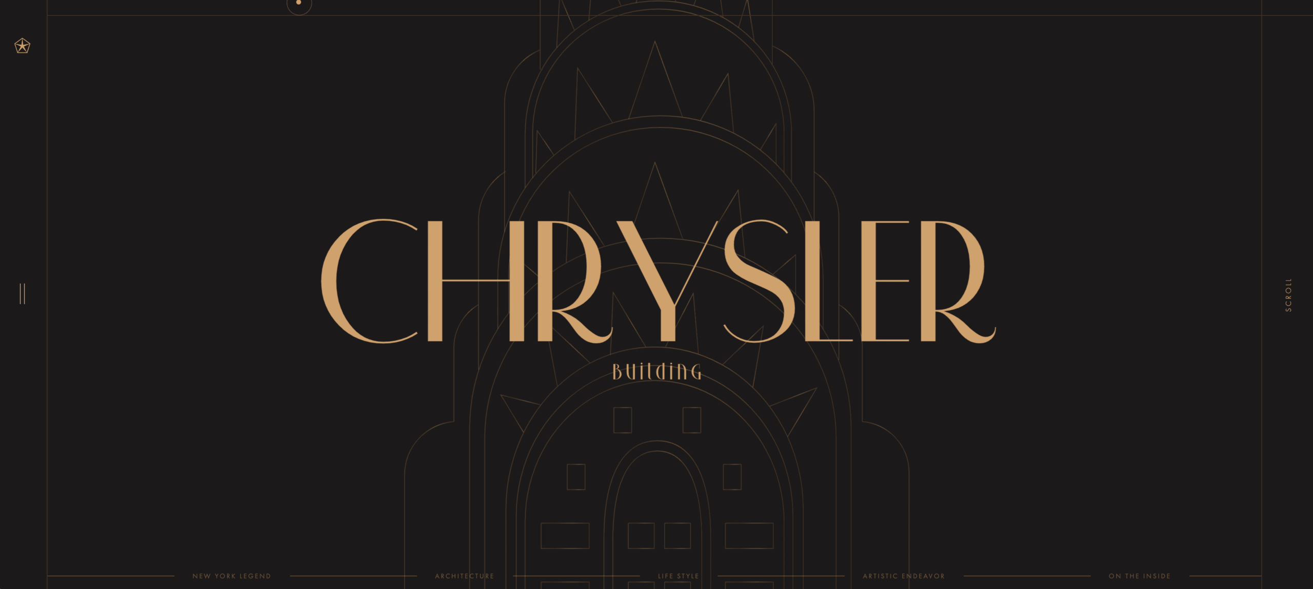
Similarly, the use of animation to draw the user in and curate their journey on the Chrysler Building website is a beautiful example of animation and design working together.
Of course, where animation is used, it’s important to include reduced motion fallbacks for those users who prefer a more static experience, and to provide an accessible website, so the design should always accommodate these.
The role of the designer in setting out the motion expectations and designing that experience is becoming more prevalent, and working together with developers to bring everything to life is becoming an important part of web projects.
Container Queries
Although this won’t make a difference to how websites look per sé, it will see a shift in thought from both the designers and developers, and should, in theory, allow for more fluid and responsive layouts at all device sizes, with less effort involved.
Container queries give developers the ability to determine the appearance of an element, and apply styles, according to the width of the container it is inside, rather than the width of the screen it is being shown on.
In real world terms this is like having a sofa, and depending on what room of your house you put it in determines the layout – in your lounge it may be a 4- seater, but moving it to your kitchen it might only work as a 2-seater, even though the width of your house hasn’t changed.
In web terms, it means we can put use the same element in multiple places, and it looks different depending on where it is placed, without the determining factor being screen size.
Browser support has officially caught up and this is now good to use in production websites.
Gradients
This one hasn’t dropped in popularity over the past few years, especially with the aurora gradient trend that has crept in. Gradients aren’t just for backgrounds anymore – they are effective for large standout typography as well as borders and icons.
This example from a 128 design webflow theme shows how using the same gradient for icons as well as headings can keep the brand colours subtly running through a page layout
Retro
‘Retro’ is an aesthetic that comes around every few years. In fashion terms this annoyingly serves as a way to remind us we’re getting old, when vintage retro to you means 60s, but is now apparently 90s, (which was only 10 years ago right?). Luckily in web design the most retro you can get is 90s, and always seems to stay 90s.
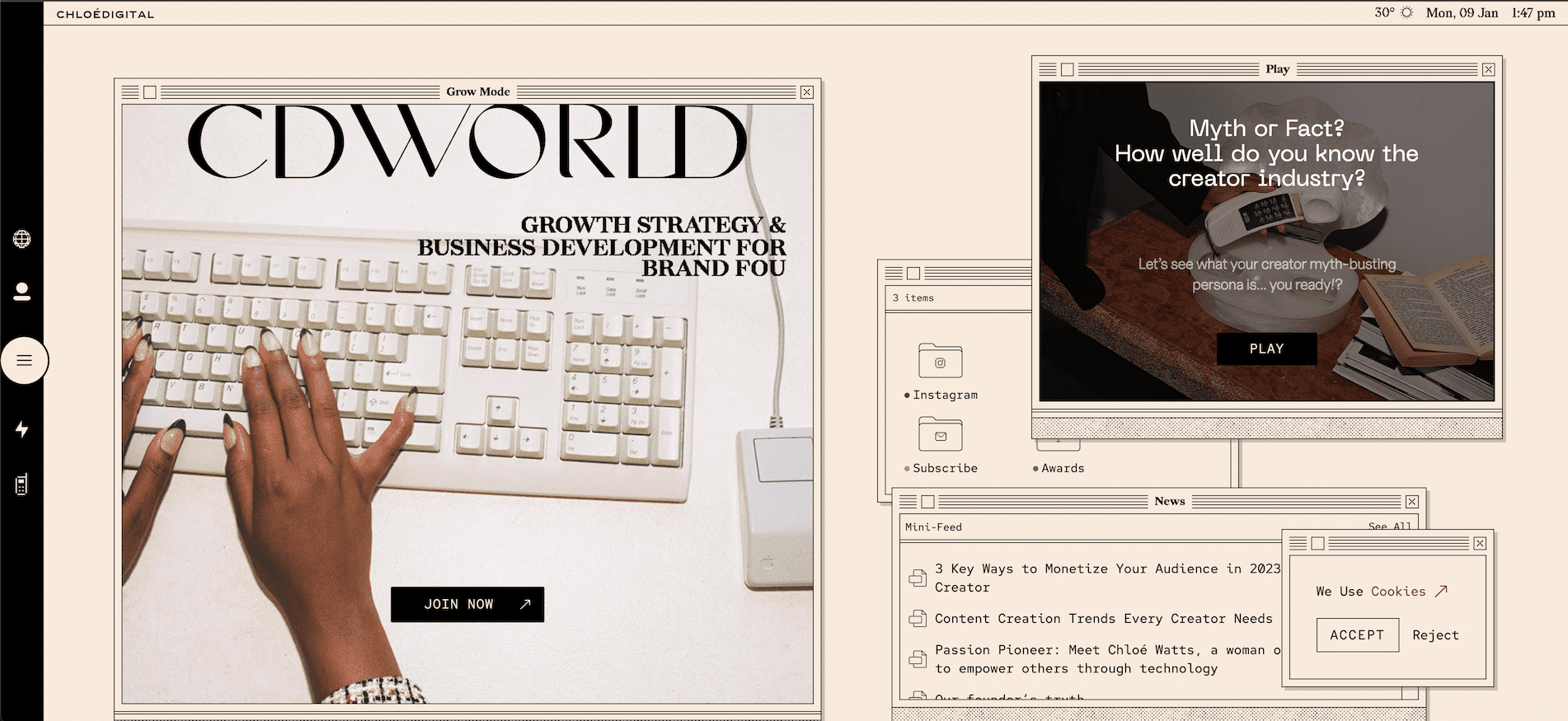
There are differing degrees of how in your face retro you can go. There’s a nice minimal, classic UI style on Chloe Digital which serves well as it allows the design to deliver unique, early 90s operating system vibes, while still functioning as expected. It also has the added fun bonus of allowing you to move the OS ‘windows’ around on the page, like an actual operating system.
One of the biggest mistakes with retro design is to get caught up in the fun design and style, and forget the purpose of the page to begin with. Form over function occurs a lot in attempts to do cool retro.
It is also essential to have the right product for the style – retro simply doesn’t work for everything and could damage trust in your product if used with the wrong intended audience.
27 nerds is another example of retro done well. Perfect target audience, brilliantly executed. Subtle nods like the old school 90s hand and pointer cursors, as well as the lovely pixelated colours backgrounds and neon blue colour, suit the style without detracting from the content. Definitely worth a scroll through to high-five the staff profile pictures.
AI
There’s little doubt that the increasing influence of artificial intelligence and machine learning on the world of design will continue apace in 2023. Read our recent article to explore some of the positives, negatives and possible dangers of using AI in creative design.
Large Typography
Large text over full screen images and animations, as well as over highly contrasting coloured backgrounds.
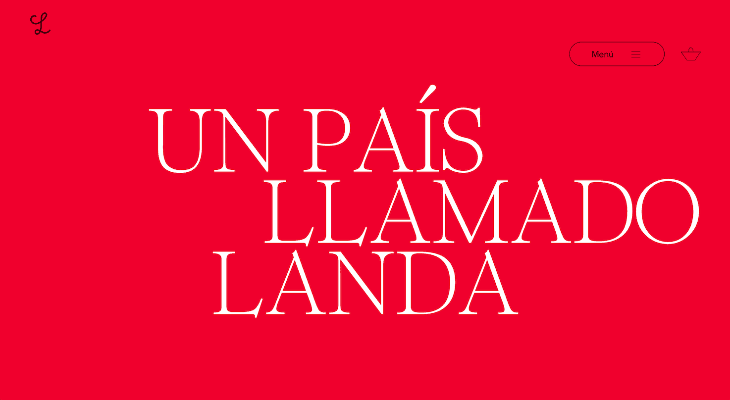
Landa is a perfect example of different ways to incorporate large typography into a site. They have it on its own with bright backgrounds, as well as curving and looping around while animating on and off screen as you scroll down the page.
Overlapping Text
With newer techniques in CSS and sufficient browser support, it’s now easier than ever for us to mimic print layouts or magazine type layouts, while keeping content responsive and accessible, and not having to rely on heavy use of text in imagery.
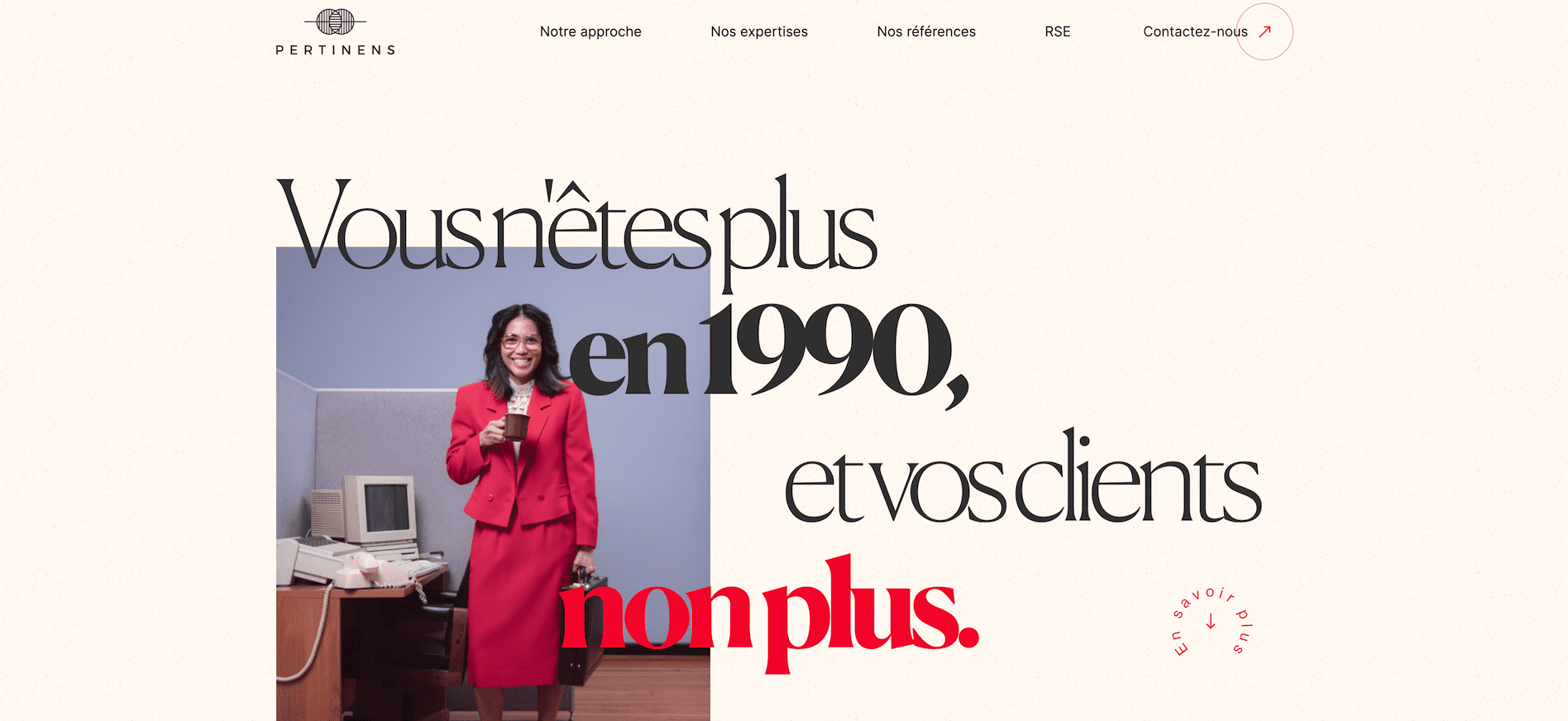
The Pertinens site has a great example of this, using different colours and font weights across multiple lines, which have a parallax effect applied to them on scroll as they disappear from view.
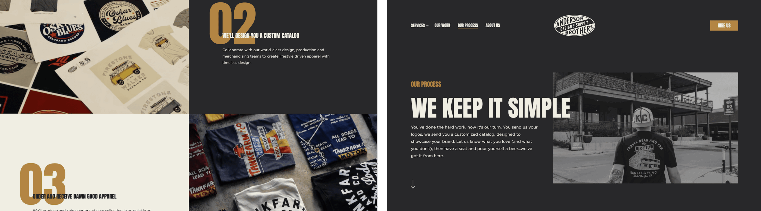
The Anderson Supply site uses it in a number of ways, both overlapping text above images, and also a lot of large typography and numbering. This once again gives more of a design-led, print feel to the content.
Keep It Simple, and Responsive
Clean, minimal, easy to navigate and find the information you came for quickly (whether on desktop or mobile screens) – these are still the keys to good web design. You can’t go wrong with a well executed, clean and simple page.
It’s easy to get caught up with trying to give your latest design the wow factor, fully loaded with content and imagery. But sometimes less is more, and it’s important to step back and assess whether you need all that content to be shown at the same time. It’s not always about grand gestures, full-screen animation and scroll takeovers, but instead lots of small and subtle micro interactions throughout a site that add consistency and enhance the user experience.
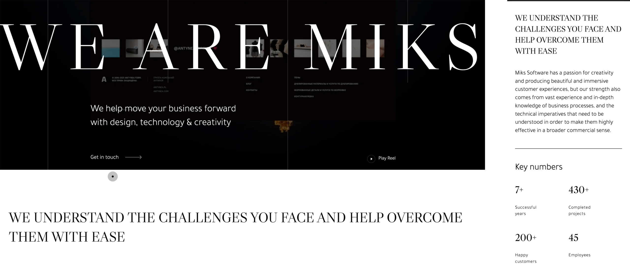
Miks website showcases how a nice content layout may appear simple but is very effective at communicating the facts, and also lends itself to a similarly good experience on mobile screens.
There’s still lots of nice animations and touches that convey quality, but in a more understated fashion that an all-singing, all-dancing website.
Insights
More for you
Let's talk.
Want to create something extraordinary? Let’s have a chat. Set up a call with our CEO, Andrew.
Stay informed.
Get our latest thinking on how to maximise brand, GTM, pipeline growth and apply AI, plus our agency updates.