Services
Website developmentStrategy & planning
UX/UI design
UX consultancy
Content strategy
Search engine optimisation (SEO)
Technical SEO
Awards



Stats
A user-centred journey to the creation of a European B2B website.
A user-centred journey to the creation of a European B2B website.
Torpedo have been an excellent partner in fulfilling our brief of wanting a modernised and consolidated European B2B web platform. They maintain excellent communication, are always on hand for support queries and most importantly, deliver on what they say they will.
Having already an existing large and mature business website, Panasonic wanted a fresh approach to user needs and an improvement in the overly complex CMS system as priorities. As well as delivering a mobile-first approach, the ability to share content across multiple countries and regions without having to duplicate the original content, utilise a compliant and highly secure Content Management System (CMS), provided freedom of content creation to admin users and met accessibility standards and importantly, introduce a new solutions architecture to the audience that would bring together products and software via industry verticals, thus accelerating innovation and technology for users.
Although Torpedo designed and built the European website, the following case study focusses mainly on our UX Consultancy services. For more information on our web development practices please visit the links in the footer.
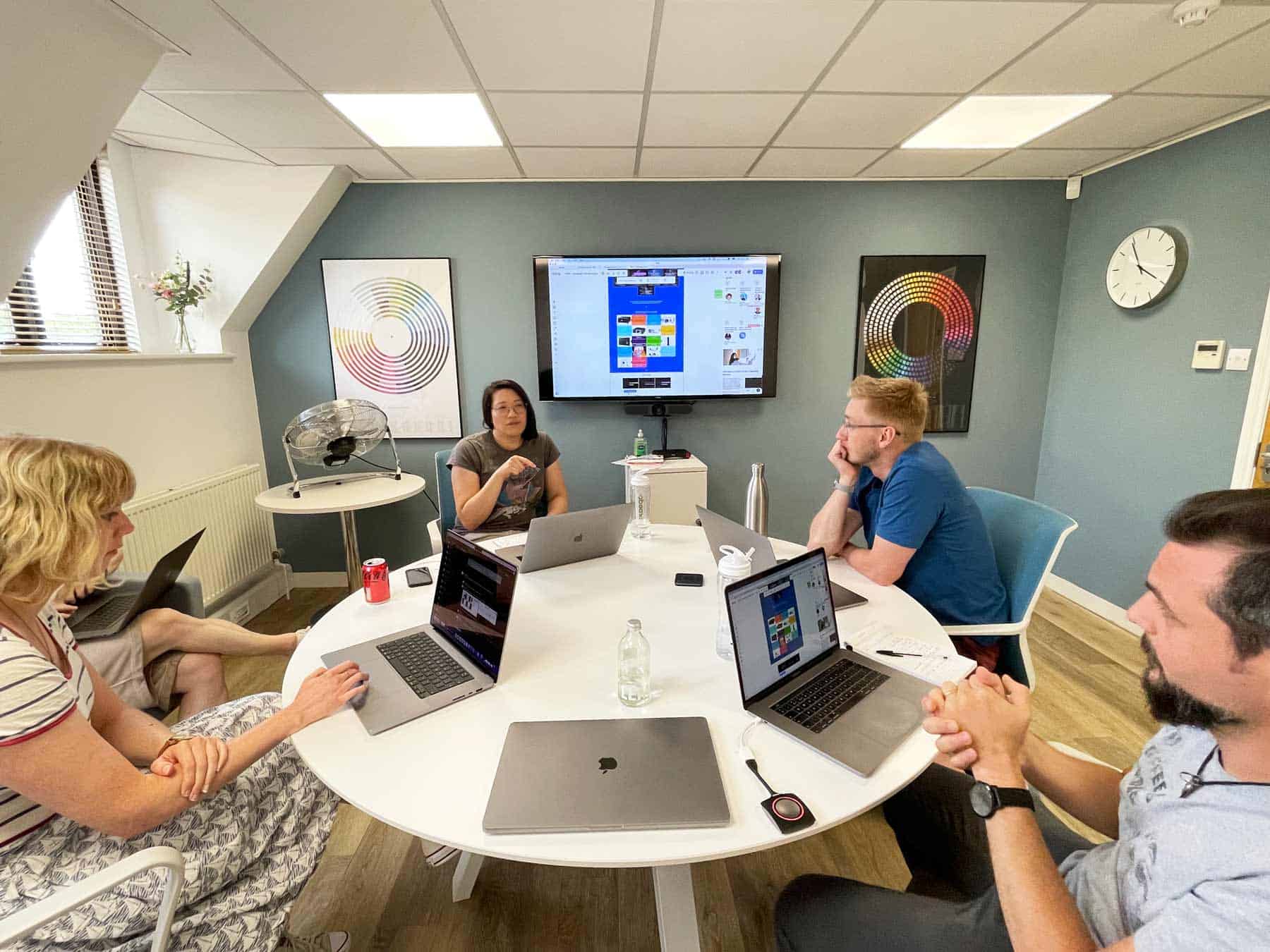
In January 2022 we started work to deliver a brand-new web platform for the European region – ideally with an October delivery which was no small task. From the beginning of the project, it appeared clear that we needed to create much improved user journeys, eliminate noise and distractions and remove overly complicated workflows for the many content creators in Panasonic.
Our focus was to design and develop a modern, customer-centric, mobile-first environment that would provide the ability to share content across the European regional area for Panasonic. We installed a scalable architecture, offering a delightful experience to the front-end user, while easing the work burden of the CMS administrators.
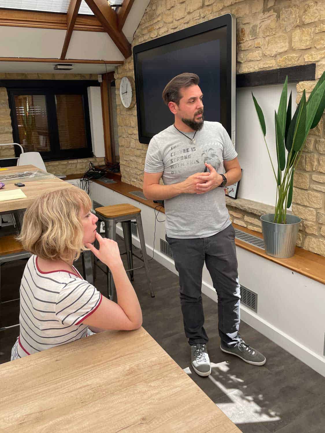
Time was of the essence, so the team got to work and started to tackle the large number of different stakeholder interests and business cases. We needed to clearly define user needs and business goals, profile personas and identify the myriad of customer journeys needed to change and improve. On top of this, part of the task was to completely integrate Panasonic’s own proprietary product management system with the new web platform.
Facing such a tight deadline also meant there was little room for unexpected circumstances, especially as there were substantial delays to the original timeline. Multiple teams within Torpedo were needed and they worked together round-the-clock to make this project a success.
Due to the scale and complexity of the project, we carefully planned our work in phases, allowing time and resources for both production and testing.
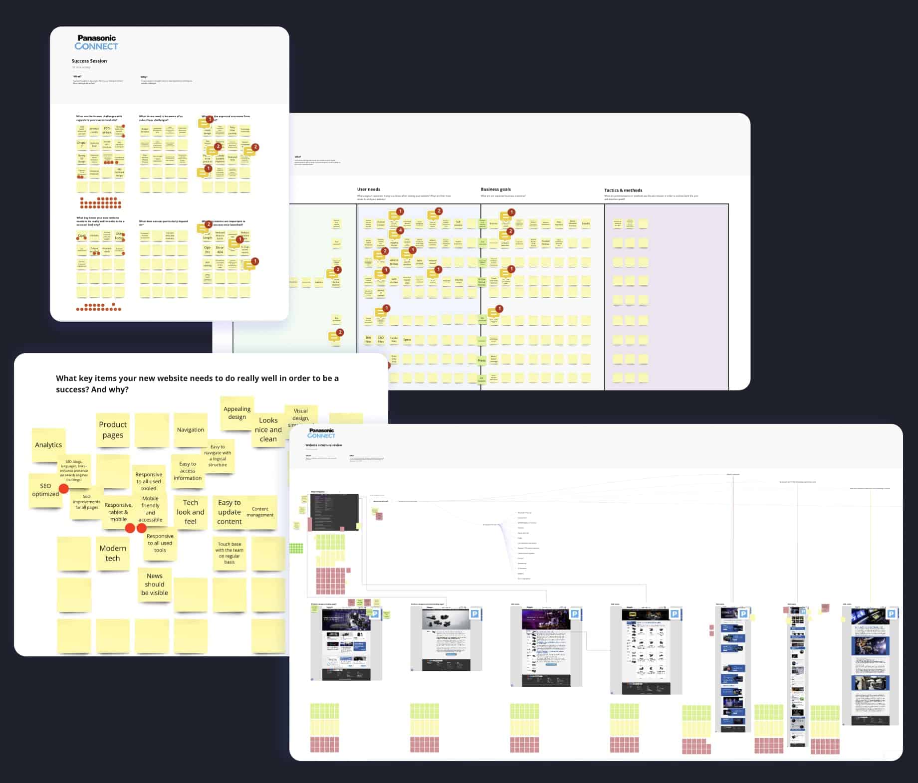
We started with a thorough analysis of the existing website, to identify the core structure, as well as obvious pain points to tackle. We evaluated the look and feel, content and information ambiguity, as well as steps needed to achieve the user needs set by the client. Before we could begin designing the new site, we needed to define and understand as much as we could about the users we were going to be designing for. We met stakeholders in a series of discovery workshops, where we set up a activities to capture user and business goals. We recorded the groups’ contributions in detail, encouraging and facilitating internal conversations to make sure all voices were heard.
We defined and outlined business goals, website user needs, CMS content manager’s needs, and general expectations (what Panasonic ultimately expected to achieve as a business). We also identified common areas and divergence between different stakeholder groups, regarding needs and expectations.
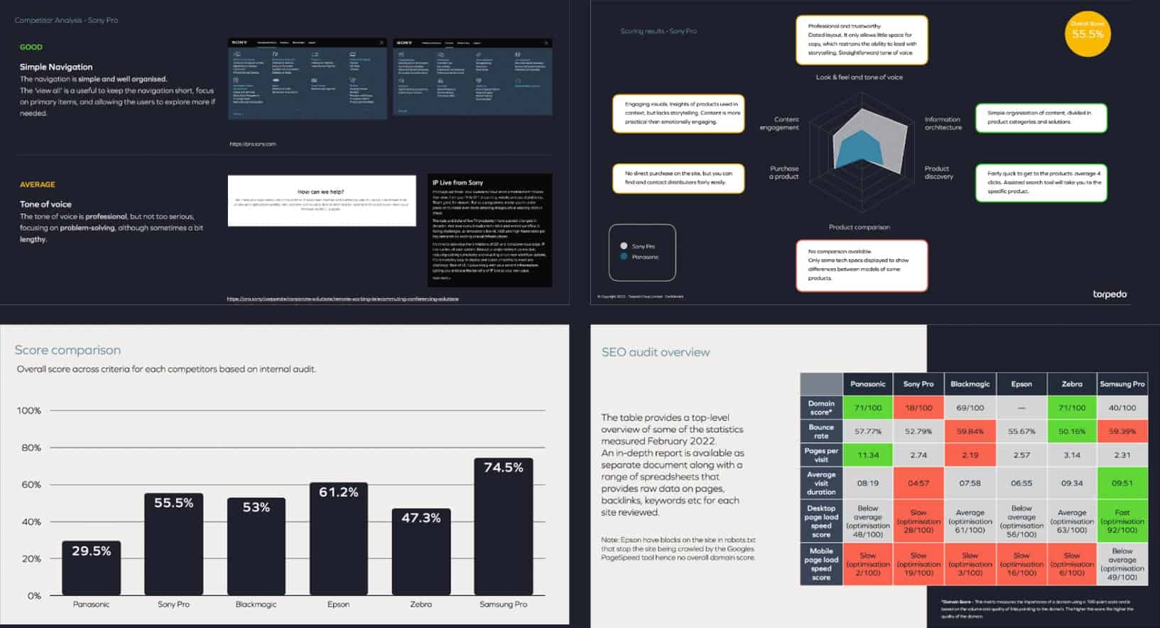
However, putting together clear user profiles wasn’t an easy task, as we were not able to access real users for this project. The workshops were therefore fundamental for us to distil information we could later translate into personas. In the meantime, we carried out an extensive competitor analysis. Panasonic pointed out the main competitors they wanted us to research, and we agreed on a set of core criteria to analyse.
We evaluated the look and feel, language clarity, organisation of the content, the user experience in finding the right product, and in comparing and purchasing products, how engaging the content was and the experience with how to get in touch with the company.
The discovery stage allowed us to set structural, functional and design reference points for the work ahead. It was also very useful for Panasonic to see in detail how their website could be positioned and how it scored in comparison with key players in the market.
Through all the research and findings we were now able to set clear goals to help make Panasonic best-in-class. For example, we identified that offering a product comparison tool would place Panasonic well above the competition and deliver a significant improvement to end users. The client found our learnings from the audit extremely useful and were happy for us to include them in the set of goals to base our next steps on.
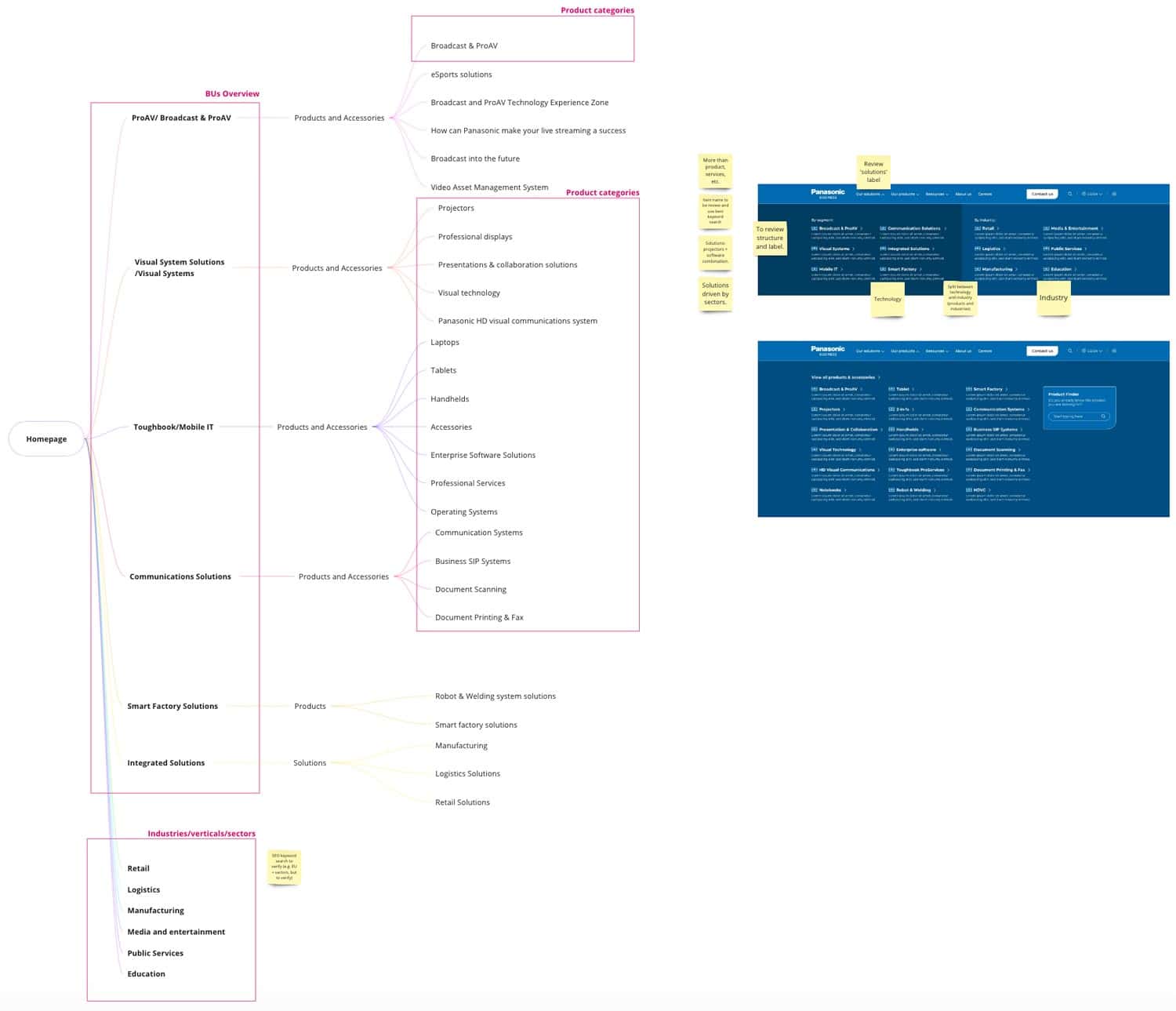
Another big piece of work in the discovery phase was to map out the Information Architecture (IA) of the new website. The initial analysis of the existing website had provided us with a good understanding of the main pain points we needed to address. Informed by the data gathered during the workshops, as well as the competitor analysis, we laid out a new navigation structure, simplified the journeys based on the personas we created, and tested the changes with the construction of userflows. The userflows allowed us to connect the dots and draft realistic scenarios the users would have to navigate through (particularly useful for QA testing as well).
A primary example on the old website is that the user had to go through as many as six clicks to find a product, while on the new website we produced an easily-accessible product page, with additional filters to help the user find the product they wanted.
As part of the brief, we needed to highlight a new solutions area that uses a combination of products within industry verticals, and it took many hours of work, revisions and client meetings to agree on the new website structure that would deliver this.
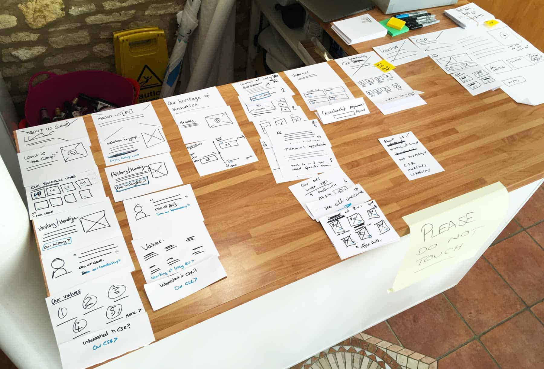
Once we had the information we needed to mould the structure in more detail, we could move forward to build a strategy to identify, optimise and prioritise the most relevant and valuable content based on user needs and business goals. This phase required a lot of thought – a one-size-fits-all approach wouldn’t be suitable due to the enormous amount of content. The Torpedo UX team joined forces with the Strategy Team to lay out the content structure of some key pages we identified together with the client. The aim was to find an optimal layout that would cater to diverse user needs, facilitating easy access and engagement with relevant content. Partnering up internally was instrumental for the next part of the process, wireframes.
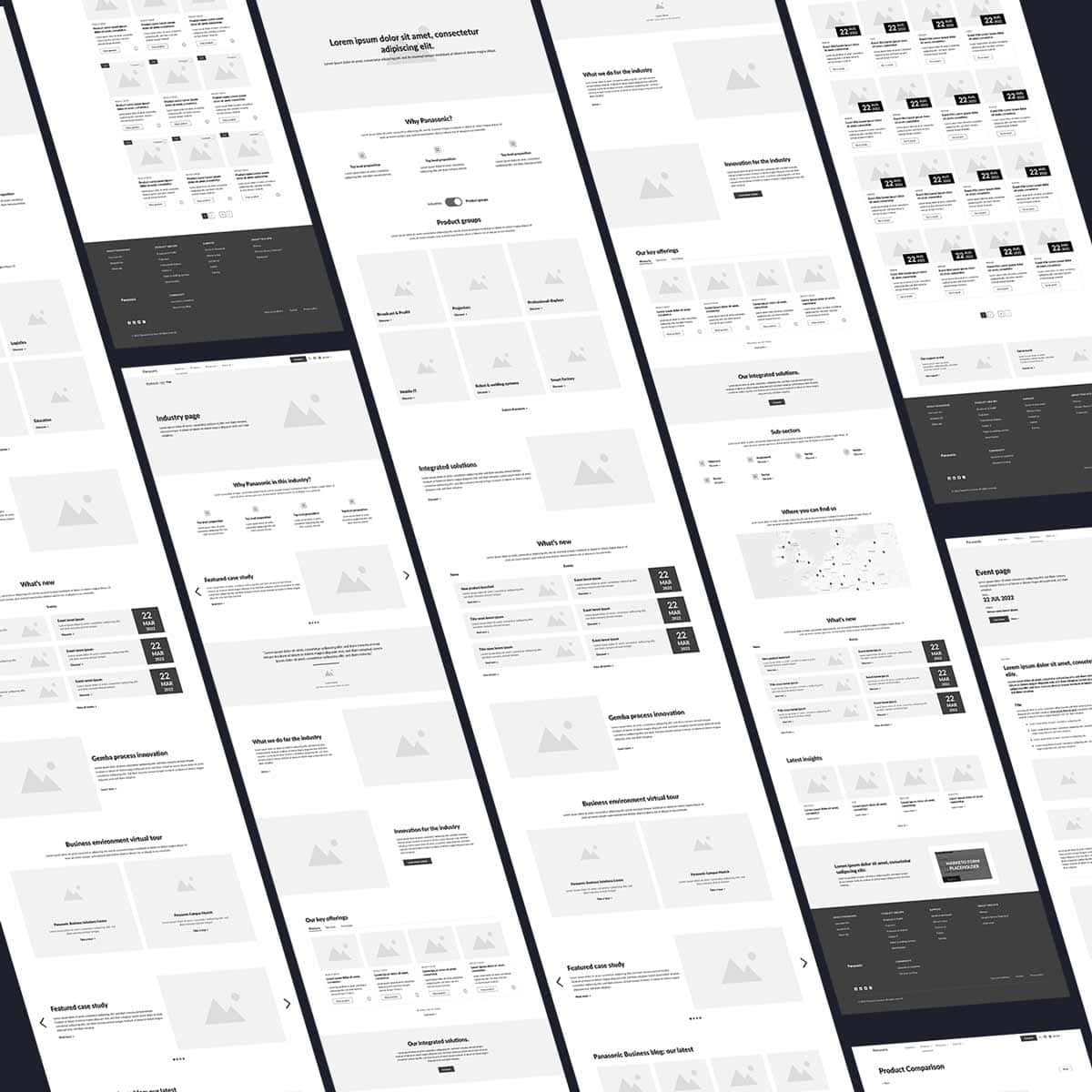
Wireframes of course are a simple visual representation of the actual interface structure. In most cases, this is the first visual asset the client sees, and it marks an important piece in the project advancement. Wireframes can be low fidelity – outlining the content without defining many details of how the different sections are going to be laid out, or high fidelity – when providing a simple but more detailed structure of sections and some possible functionality, such as image galleries or number of columns.
For Panasonic we needed to create high-fidelity wireframes to provide the vision of what we wanted to have in the User Interface (UI) including the interactions. The task was vast, and it took several weeks for us to organise the pages, create a skeleton of the interconnections and, by doing so, a realistic draft of the website navigation. To make sure the wireframes aligned properly to the business goals and user needs, we worked with the stakeholders, collecting feedback, and amending the wireframes where necessary. Due to time constraints we couldn’t test the wireframes with real users, however, we tested the architecture and the page structures internally, simulating real user scenarios.
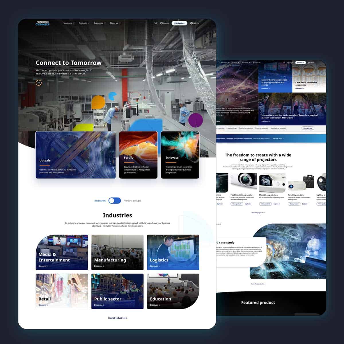
With a structure in place, we could now focus our attention to the UI. This delicate phase is often perceived as the most perilous, as all the work carried out until now comes together to create a tangible product. Only if the discovery and strategy phases have been fulfilled appropriately will the UI be successful in tackling the pain points and resolving the issues.
Our challenge was to bring together different stakeholders needs, create a smoother and simpler user experience, build an easier way to create, manage and share content across multiple regions, and integrate Panasonic’s huge product database.
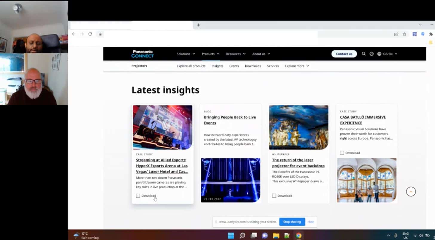
Once again, our focus on the users was paramount, especially since we were going to conduct usability testing. We worked on the UI design for a few weeks, paying attention to every little detail. The client gave us a very empowering direction, when they asked us to experiment and try different solutions, to create something fresh and unexpected. Usability testing was vital during the whole design phase. It helped to balance out the business needs that could potentially steer the direction away from simplifying the experience, and enable us to find solutions that would cater for stakeholders and users alike.
The most prominent example, and the element we tested the most in this phase was using the sub navigation on specific sections of the website. We needed to ensure a happy medium was found between the stakeholders and users and after multiple conversations with the stakeholders, testing with users and iterations, we created a neat and functional solution.
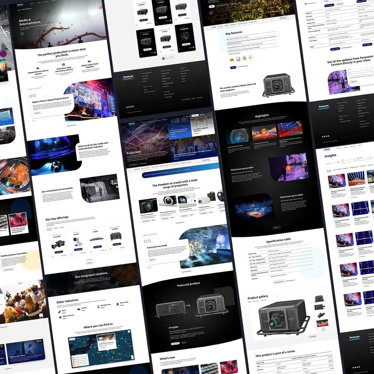
As with any project on such a huge and complex scale, there were challenges. But, we overcame every complication, firmly keeping the goal in sight.
When we presented our final work, the stakeholders were struck by what would be possible with the new structure, how much simpler it looked and felt, and the visually striking interface. The users we talked to had a positive experience, found the website visually impressive, easy to navigate, professional and clean looking, and singled out the product comparison as the best feature.
It was undoubtably a big success of which we are proud.
Our main aim in this project was to design for the user. To make the new Panasonic Connect Europe website intuitive, engaging, memorable, accessible and inclusive.
After thirteen months of hard work, including the development phase, we delivered a mobile-first, modern, clean, scalable and functional multilingual website, contributing to helping the client simplify their process, cut overheads and reduce digital clutter.
By focussing on their customer’s experience, Panasonic Connect have seen incredible results from their new website. Since launch, there has been a huge 300% increase in mobile traffic, a 325% increase in user engagement from mobile devices, an incredible 525% increase in visitors to product pages and a 200% increase in downloads. Customers are engaging with the new Panasonic Connect website more and for longer, so far recording an increase of more than 120,000 user actions with the new website and a staggering drop of almost 14% in bounce rate (no small task for a mature website to achieve).
The stats and feedback are overwhelmingly positive and showcase the enormous success of this project, which continues to expand – we are already implementing the next set of features.
As a bonus, now the EU site is complete, Asia Pacific and Oceania have adopted the same web infrastructure, enabling a cost-effective expansion that provides even more regions with their own new and much-improved websites.
Strategy and planning
Innovative design and brand ideas
Large digital platform
Meticulous UX process
Research community hub
Designed to innovate