A little more action, please: 6 ways to make your ‘calls to action’ work harder.

15th February 2019 • 5 min read
15th February 2019 • 5 min read
As marketers, we’re all fixated on getting more action. Everything we do, every press release we draft, every email campaign we launch and every new page we add to our website is ultimately designed to do just one thing: to get our customers to take action.
And while our research, campaigns, user experience design and so on are all centred on driving our customers to act, there’s one small (and often overlooked) element of any email or webpage that does a lot of the heavy lifting.
It is, of course, the Call to Action (CTA). And the chances are, yours aren’t working as hard as they could be. The good news is that changing one single, simple thing will help you write killer calls to action for evermore. But before we get to that, here are five other common call to action pitfalls to avoid.
1. You don’t think about it until the end
In the rush to use the gorgeous new brand, share the exciting case study or launch the website updates, it’s easy to forget about the most crucial question of all: what do you actually want the customer to do?
Instead, decide what action you want people to take before you begin writing. Your content will build up to your call to action – and both will be much more effective.
2. You only add it at the end
So, you’re creating a landing page. Where’s the best place to put the call to action? Easy. You put it at the exact point at which you’ve managed to persuade your customer.
Unfortunately, it’s nearly to impossible to know where that will be. The next best thing is to have multiple calls to action at different points on the page, especially for mobile users and especially if it’s a long page.
Once you’ve convinced your user to take the next step, don’t leave them scrolling around wondering what to do next. Put your call to action in various places, including at the top of the page. Users will understand from the beginning what the end point is, and they’ll be primed to act.
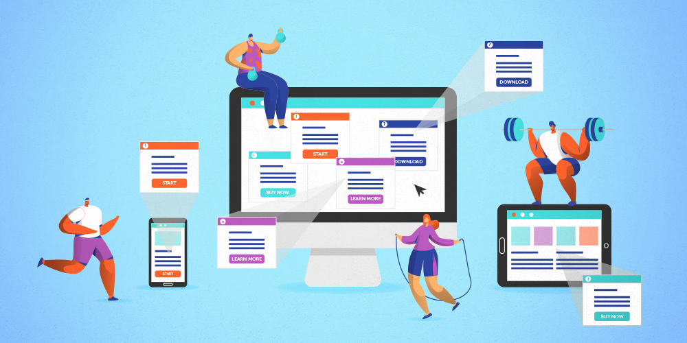
3. You just add a button
A call to action is more than just a button. In fact, it’s best to think of it as a collection of elements that includes a link (which is usually styled as a button).
Calls to action tend to include a headline, can include a small amount of body text and could also include an image and a secondary link or button too. All of this is in addition to the primary link.
These things all hang together as a ‘Call to Action’ thanks to the Gestalt principles of proximity that explain why our brains perceive elements as a group when they are placed close together.
4. You keep it short
Conventional wisdom has it that button text and links should be short. Sometimes brand guidelines dictate that they should be no more than two or three words.
Certainly, they have to be easy to understand. That’s crucial. But short isn’t the same as easy to understand: a slightly longer button that makes sense is better than a short, cryptic one.
What’s more, there’s a law which shows that the larger the ‘target’ (in this case the button), the quicker and more easily a user will be able to select it. So longer buttons can actually be a good thing.
And given that in one of the most common page scanning patterns, users spend most time looking at your headlines, links and buttons it pays to make sure your buttons work as hard as possible. Read on to find out how.
5. You haven’t got a ‘hook’
More than anything else, your customers care about themselves. If they’re engaging with your content, it’s because there’s something in it for them.
So, if you want to users consider doing what you’d like them to do, you’d better make sure you hook them in by focusing on what they care about.
And the one single, simple change you can make to help you write CTAs that knock it out of the park? Here it is:
There’s a tin in your food cupboard. It’s probably been there a while, because the label has come off. It could be beans. Or peaches. Or dog food.
Would you open it? Maybe if it was the last tin of food you had. And you were starving.
A button that says something generic like ‘read more’ or ‘click here’ is the web equivalent of the unlabelled, unloved tin at the back of your cupboard. Users are less likely to open it for the same reason – they don’t like uncertainty. They want to know what’s going to happen next.
If you only change one thing about your CTAs, write button copy that does what it says on the tin.
The copy on the button needs to tell users what happens, or what they can do, after they’ve clicked: ‘Read the blog’, ‘Download the brochure’, ‘See recipes with peaches’ are all good examples. Not only will it make users more likely to click, it also gives them (and Google) a better understanding of your website and its structure. So everybody wins.
Talk to our team to see how we can help you create content, campaigns and websites that get the results you want.
Let’s Talk