An interactive infographic designed to give developers as much – or as little – information as they want.
An interactive infographic designed to give developers as much – or as little – information as they want.
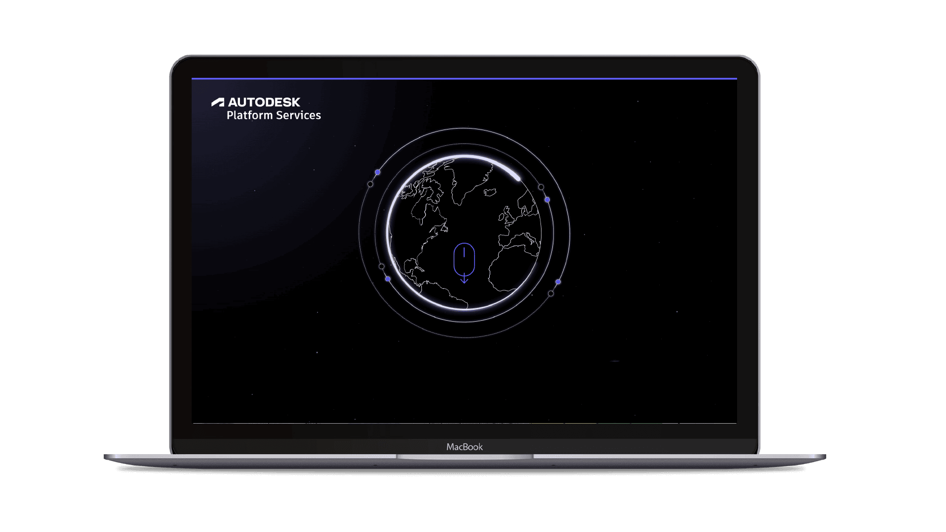
APS – Autodesk Platform Services – is at the heart of Autodesk. Formerly known as Forge, six years ago, it had just six APIs and a handful of vendors. Today, reinvented as APS, it has over 60 APIs, 5,000 cloud-based applications and 4,000 active developers.
Our brief was to create an infographic to raise the profile of APS among software developers and educate them about its impressive offering. The client wanted the infographic to encourage sign ups to trial the platform too. From a design perspective, they asked us to follow a similar aesthetic to a video we’d previously produced for them.
From day one, we took a collaborative, creative approach, regularly involving all relevant team members – from content strategy to UX and design. Together, we decided it was worth proposing a slightly different deliverable. To ensure all the valuable content got its limelight while not overloading the user, we advised our client that a user-driven campaign landing page would be a more fit for purpose way to deliver the infographic. The client was receptive to our approach and agreed to this proposal.
Unusually, we were asked to hand over the assets to the client’s in-house software developer to build. This meant we also had to keep them in the loop as we developed our approach to ensure the execution was feasible.
We took to Miro to lay out the main content themes from Autodesk’s brief. We conducted a content audit of all APS assets that were already live, collating and curating the information.
We looked at the content objectives, the positioning for APS, the top pain points APS addresses, and as a result defined a simple and compelling value proposition and some tangible user benefits. We reviewed all the APIs and started to organise them by product. Stats and testimonials were compiled, and we cherry-picked the best ones.
We wanted time-poor developers to gain an at-a-glance understanding of what APS could offer them – empowering them to interact with the elements they wanted to know more about.
So, we started with the value proposition and supported this with social proof – listing the logos of businesses already benefiting from the platform’s capabilities and testimonials. Next, we moved on to talk about the main gains for the user.
At this stage, we gave the user two routes. We wanted to make it easy throughout the journey for users to either keep exploring, diving into greater detail, or, if they felt they had enough information, give them the opportunity to sign up for a free trial.
Maintaining our collaborative approach, we all conducted some market research for creative inspiration. We put our software developer hats on and went in search of sites that we believed they’d like – both from a visual perspective and a user experience. We knew there was a lot of information to convey and wanted to see how we could leverage different interaction functionality. It was also important to us that there was plenty of breathing space – to avoid a cluttered look. We opted for a technical, professional aesthetic.
Wireframes were assembled, addressing the main challenges of how to house all the content, while keeping engagement high. It needed to maintain a high-tech feel throughout and have easy navigation. After the first ‘layer’ of overview content, we added a ‘sticky navigation’ to support this.
The usability testing we carried out also helped during the decision-making days. We wanted to test the level of engagement with the landing page. Were users reaching the end? So, we added a pop-up dinosaur – a ‘usersaurus’ – at the very end of the journey to test this.
Feedback from testers included wanting a little more explanatory copy on APS, a scroll bar for better navigation and more obviously clickable customer stories.
The technical look and feel of the design came from the video’s opening sequence, giving consistency throughout the different assets and staying on brand. The space theme was inspired by the idea that APS gives you ‘limitless opportunities’. We also added some 3D elements to the API information cards, to add depth and keep it interesting and interactive. We did the same with the customer stories, to ensure they were clearly clickable.
Autodesk had requested that they receive the assets in a state for their in-house developers to build the landing page. The process worked very well and we built a good relationship with their team.
Taking a gamble by suggesting a bigger project (and bigger investment) on the original brief, paid off. The client is very happy and the more comprehensive deliverable looks like it’ll lead to more work in the future – animations, videos, e-books, more landing pages and, fingers crossed, some awards!
It’s still early days for the landing page so we don’t have data to share at this stage. We will add these soon, but in the meantime, we’ll leave you with some comments the client has shared with us:
“ This was one of the coolest Autodesk pieces that we’ve seen. It’s both on brand and unique. Engaging and informative.” ”
“ Big thing is that we follow up on this experience with rich demos, video and animations or even an e-book. ”