Reshaping User Experience with Japanese Design Aesthetic.
Services
Website developmentNTT Data, a renowned global IT business services provider, sought our expertise in UX research and design to revitalise their digital platforms with a user-centric approach. Having won a very large tender process where our designs were well received, we were surprised that our initial working design drafts failed to meet the client’s high expectations. In essence they wanted us to really push the brand into a direction that hadn’t been explored.
Having begun with discovery workshops and listening to key stakeholders a breakthrough occurred when we introduced the idea of integrating the captivating Japanese design aesthetic that was in the company heritage. Through a collaborative process and interactive workshops involving members from across the company, we discovered the transformative power of Japanese design, ultimately achieving impressive results.
At the outset of the project, we faced the challenge of developing a design solution that truly resonated with NTT Data’s target audience. Our initial design attempts, though meticulously crafted, failed to wow the client, and fell short of their expectations. It became evident that a different approach was necessary to capture the essence of their brand and create a memorable user experience.
Recognising the significance of NTT Data’s Japanese heritage and the opportunity it presented, we proposed integrating elements of the Japanese design aesthetic. This concept sparked curiosity and excitement among both our team and the stakeholders, leading us to believe that infusing Japanese design principles could be the catalyst for a successful redesign.
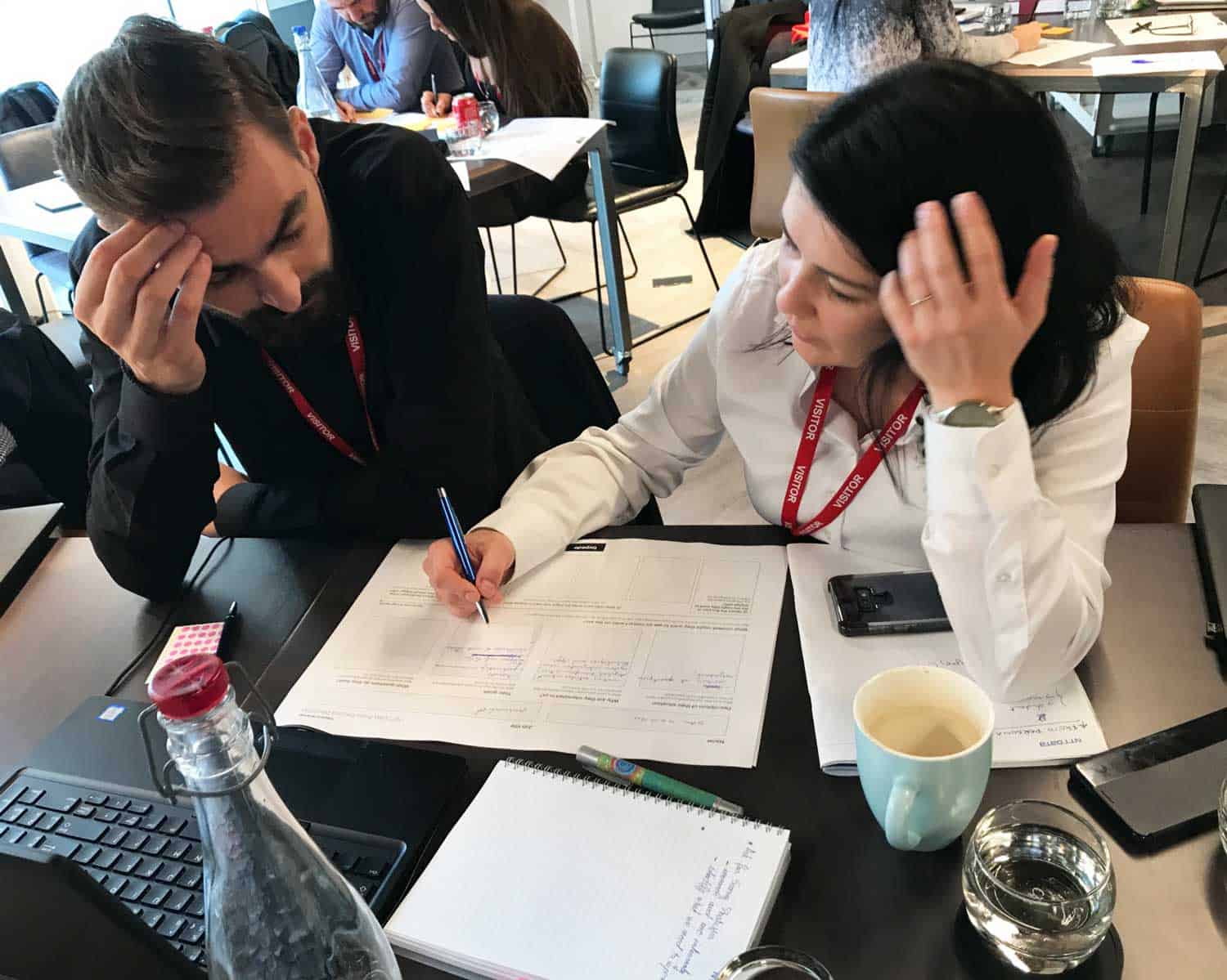
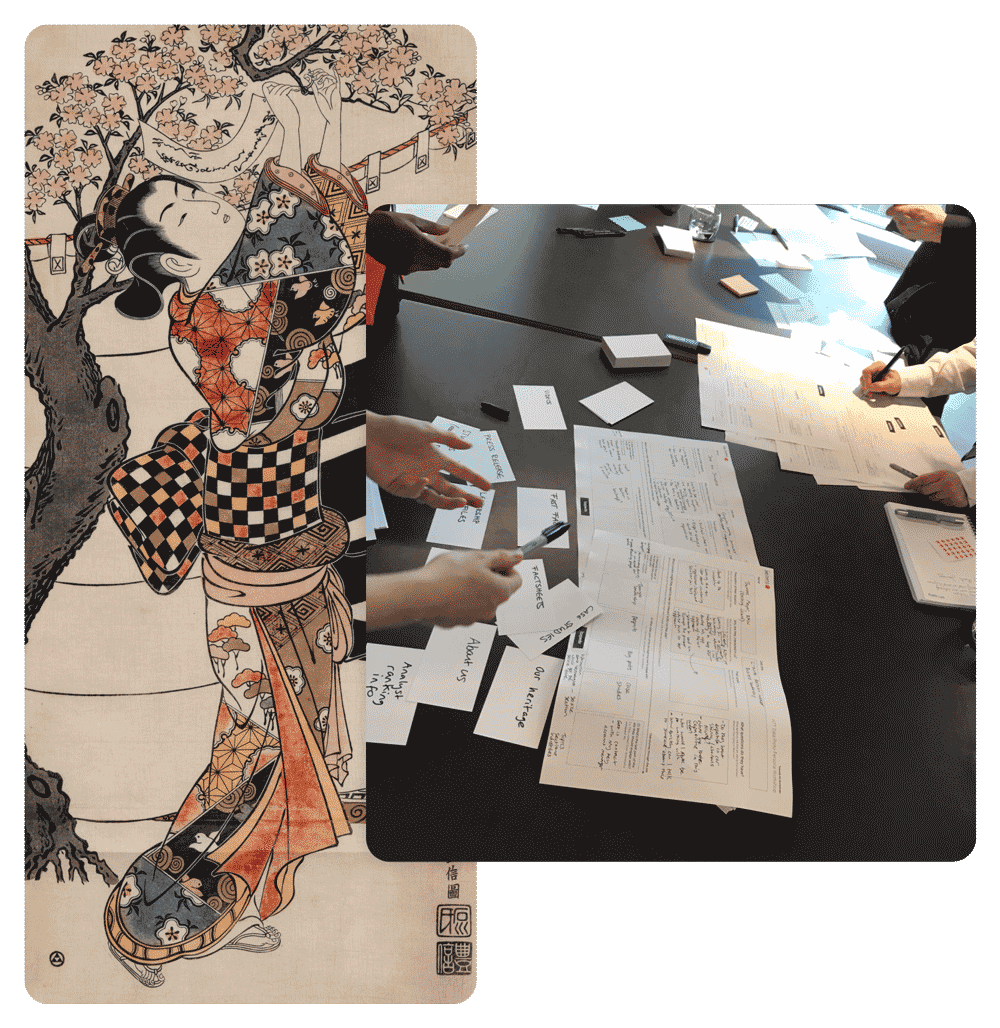
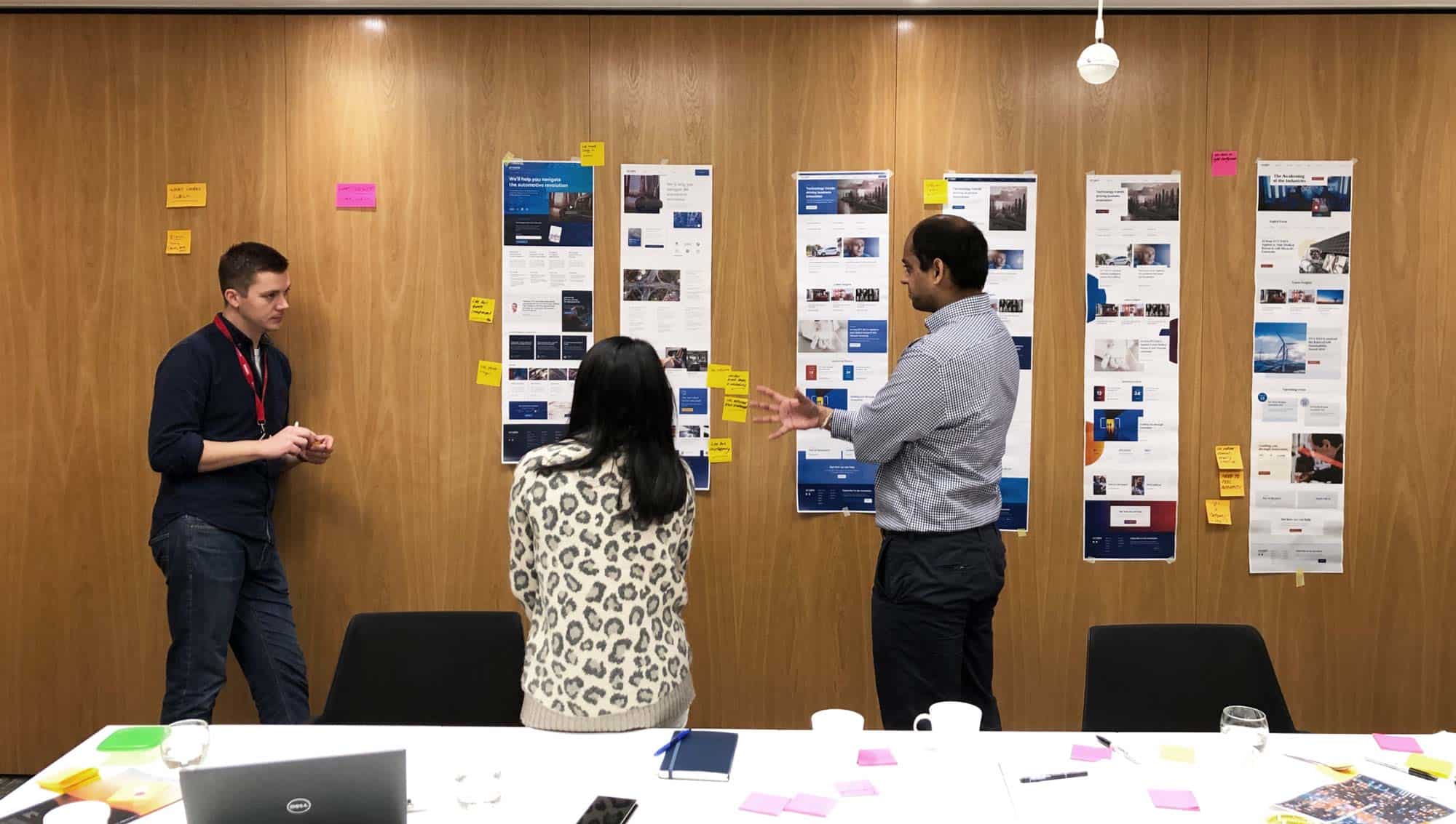
To explore the potential of Japanese design aesthetics and gather input from stakeholders, we organised a series of interactive workshops. These sessions aimed to educate and inspire participants, encouraging them to reimagine the user experience from a fresh perspective.
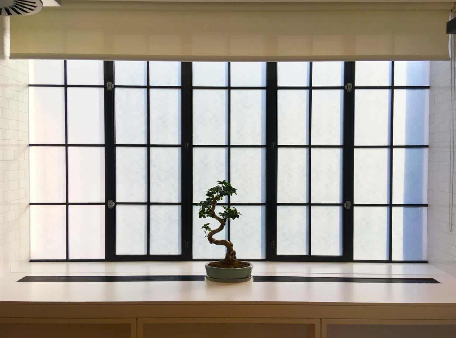
During the workshops, we provided an engaging presentation on Japanese design principles, highlighting its unique characteristics, including minimalism, asymmetry, and reverence for natural elements. This introduction helped stakeholders understand the underlying principles that would guide our redesigned approach.
We facilitated brainstorming sessions where stakeholders actively participated in generating ideas and discussing possibilities. By encouraging open dialogue, we fostered a creative environment where stakeholders from various departments could contribute their insights and perspectives.
To deepen our understanding of Japanese design aesthetics, we immersed ourselves in various aspects of Japanese culture. This included showcasing traditional art forms, such as Ikebana, Wabi-Sabi, and Shibui, and highlighting their philosophies and visual elements. The immersive experience sparked inspiration and encouraged us to think beyond conventional design boundaries.
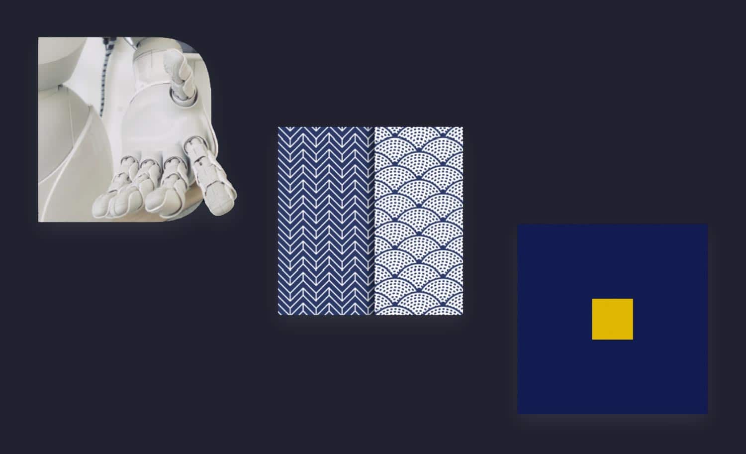
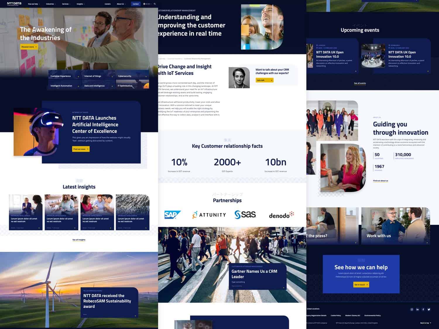
Building upon the insights gathered from the workshops, we began incorporating the captivating elements of Japanese design into the redesign process. This integration brought about a remarkable transformation, aligning the user experience with NTT Data’s brand essence, and capturing users’ attention in a profound way.
Inspired by the Japanese principle of minimalism, we adopted a refined and simplified user interface. Unnecessary elements were eliminated, and the focus was placed on essential information, creating a clean and uncluttered design that allowed users to navigate with ease.
Through the concept of asymmetry, we introduced subtle imbalances and deliberate irregularities into the design, adding visual interest and evoking a sense of dynamism. This departure from traditional symmetrical layouts injected an element of surprise, captivating users’ attention while maintaining a harmonious overall composition.
We drew inspiration from traditional Japanese architecture and design, infusing digital interfaces with natural material textures. Elements such as wood grain and paper textures created a tactile experience, evoking warmth, authenticity, and a sense of familiarity, thereby enhancing user engagement.
During the redesign process we encountered the challenge of managing multiple stakeholders from across the globe, with both diverse perspectives and conflicting opinions as to what was needed. To effectively manage expectations, we brought the teams together to better understand their roles, interests, and influence within the organisation. This helped us identify key decision-makers, influencers, and potential sources of conflicts as well as build strong relationships thus enabling us to bridge conflict and develop a tailored stakeholder management strategy that kept everyone on the same winning team.
From the outset, we emphasised the importance of defining clear objectives for the project. We engaged stakeholders in discussions to align their expectations and identify shared goals, ensuring everyone had a common understanding of the project’s purpose and desired outcomes. This collaborative approach laid the foundation for productive stakeholder engagement.
We adopted an inclusive communication strategy, establishing regular channels for dialogue with stakeholders. This approach aimed to create an open and transparent environment, enabling stakeholders to express their concerns, ideas, and suggestions. Through collaborative workshops, meetings, and feedback sessions, we actively involved stakeholders in the design process, giving them a sense of ownership and influence.
We conducted thorough requirements gathering sessions, where stakeholders from different departments shared their specific needs and priorities. By actively listening to their perspectives, we identified commonalities and areas of overlap, enabling us to find middle ground and build consensus around essential design elements.
Throughout the design process, we organised iterative design reviews, involving stakeholders in evaluating and providing feedback on design concepts and prototypes. These sessions encouraged constructive discussions, allowing stakeholders to voice their opinions and concerns. By facilitating dialogue and addressing concerns promptly, we were able to navigate conflicting viewpoints and arrive at mutually agreeable design decisions.
In cases where stakeholders held strongly opposing views, we acted as mediators, facilitating constructive conversations to bridge the gaps. We encouraged stakeholders to listen to each other’s perspectives, find common ground, and identify compromises that would meet the project’s objectives. Our role as impartial facilitators helped build trust and fostered an environment of collaboration.
To transcend conflicting stakeholder views, we continuously emphasised the importance of user-centric design. By refocusing discussions on user needs, preferences, and goals, we encouraged stakeholders to prioritize the ultimate user experience above individual preferences. This empathetic approach allowed stakeholders to see beyond their personal biases and align their decisions with the best interests of the users.
To support objective decision-making and minimise subjective biases, we leveraged data and research insights. By presenting stakeholders with user research findings, usability test results, and industry best practices, we provided evidence to support design choices. This data-driven approach helped steer discussions away from personal opinions and towards solutions grounded in user needs and preferences.
As part of the website redesign project for NTT Data, one of our key goals was to ensure effortless user navigation that nurtured and converted the target audience. This case study highlights our approach to creating a seamless navigation experience that guided users through their journey, nurtured their engagement, and increased conversion rates.
We began by conducting thorough user research to understand the target audience’s needs, preferences, and behaviours. Based on these insights, we crafted a user-centric information architecture that organized the website’s content in a logical and intuitive manner. The navigation structure was designed to reflect users’ mental models and align with their expectations, allowing for effortless exploration and discovery.
We focused on creating a clear and intuitive menu structure that facilitated easy navigation. The main navigation menu was designed to be concise and prominently displayed, providing clear labels that accurately represented the content categories. Sub-menus and drop-down options were utilized to organize deeper levels of content, ensuring users could quickly find the information they were seeking.
To enhance navigation and enable users to find specific content or resources, we implemented a robust search functionality. The search feature was optimised to deliver accurate and relevant results, considering user search behaviour patterns. Additionally, we incorporated filters and sorting options to refine search results, allowing users to quickly narrow down their choices and find the most relevant content.
We maintained consistency in design patterns throughout the website by creating a design system to ensure familiarity and ease of use. This included consistent placement of navigation elements, such as menus, search bars, and navigation buttons, across different pages. By following established design conventions and utilizing familiar UI patterns, we minimized cognitive load and provided users with a sense of control and predictability.
We employed effective visual hierarchy to guide users’ attention and encourage exploration. Important information and key actions were visually emphasized using size, colour, contrast, and typography. By creating a clear visual path, we directed users towards desired content and conversion points, increasing the likelihood of nurturing their engagement and driving conversions.
To nurture and convert the target audience, we streamlined the conversion funnel, ensuring a seamless progression from initial engagement to desired actions. We carefully designed the user journey, mapping out the steps users would take to move closer to conversion. Clear and compelling calls-to-action (CTAs) were strategically placed at various touchpoints, guiding users towards the next step in the funnel.
Recognising the importance of mobile browsing, we prioritized responsive and mobile-friendly design. The website was optimized to provide a consistent and enjoyable experience across different devices and screen sizes. Efforts were made to ensure that navigation elements, content layout, and interactive features adapted seamlessly to mobile interfaces, enabling users to navigate effortlessly regardless of their device.
To ensure ongoing improvements to the navigation experience, we conducted regular user testing and analysis. Through usability testing sessions and gathering user feedback, we identified pain points, bottlenecks, and areas for enhancement. This iterative process allowed us to refine navigation elements, information architecture, and interaction design based on real user insights, ultimately creating a more effortless and conversion-driven navigation experience.
The combination of Japanese design aesthetics, along with the Kaizen approach to continuous improvement, ensured alignment with NTT Data’s Japanese heritage. We were able to adapt and adjust, turning challenges into opportunities and delivering an experience that delighted users and stakeholders alike.
Multiple instances merged in one
Vast multi-language structure
Front-end and Back-end UX
Meticulous UX process
Research community hub
Designed to innovate