Become extraordinary.
Shifting perception, building belief and creating momentum when it matters most.

Extraordinary impact
The moments that shape your business trajectory demand more than good ideas. They demand clarity, conviction and delivery that moves the business forward. This is where it comes together – we help B2B technology brands define their position, launch with impact and build demand that drives pipeline.
Filter by:
clear filters


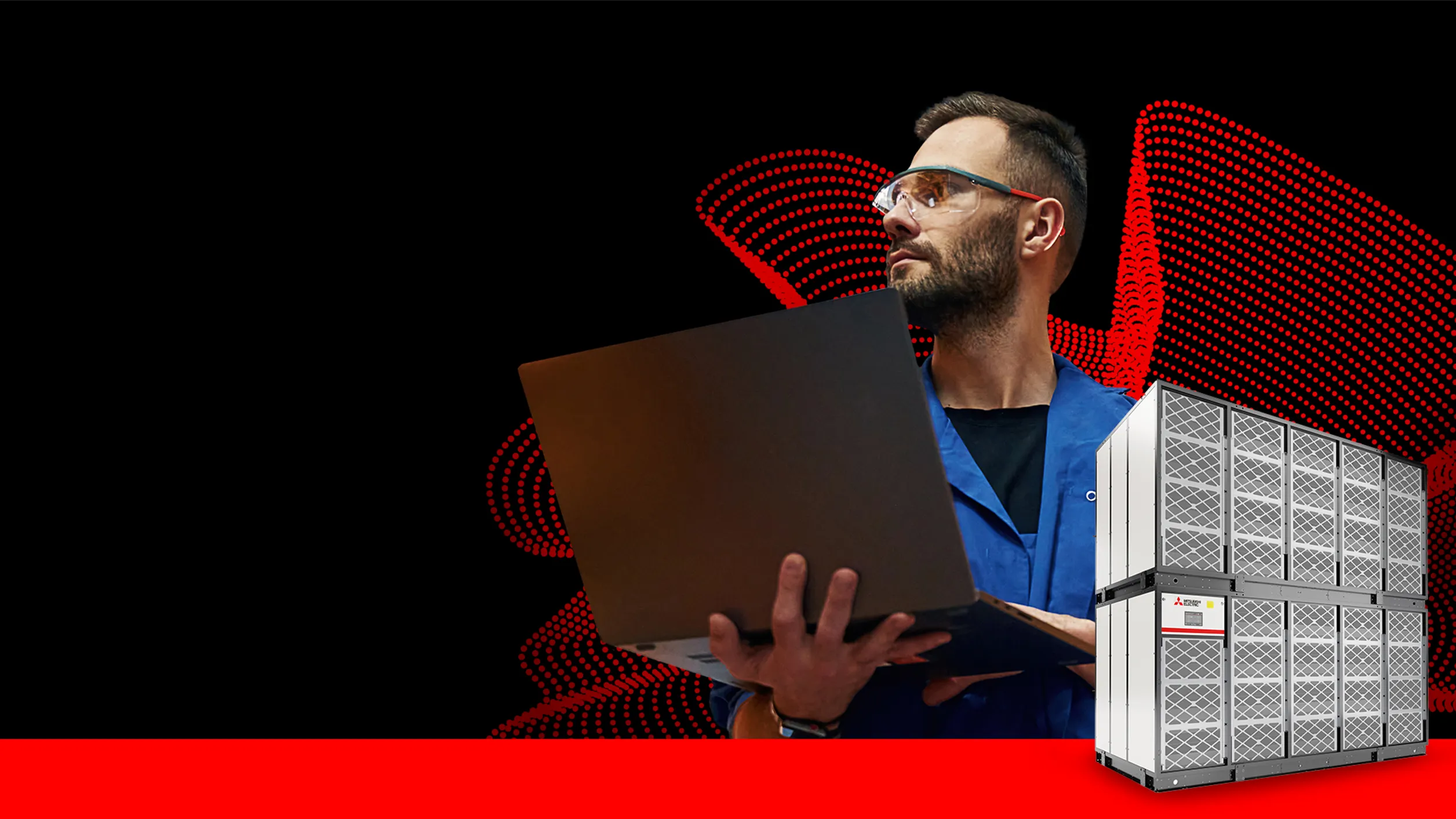
Mitsubishi Electric
Growing brand confidence in a data-driven world.
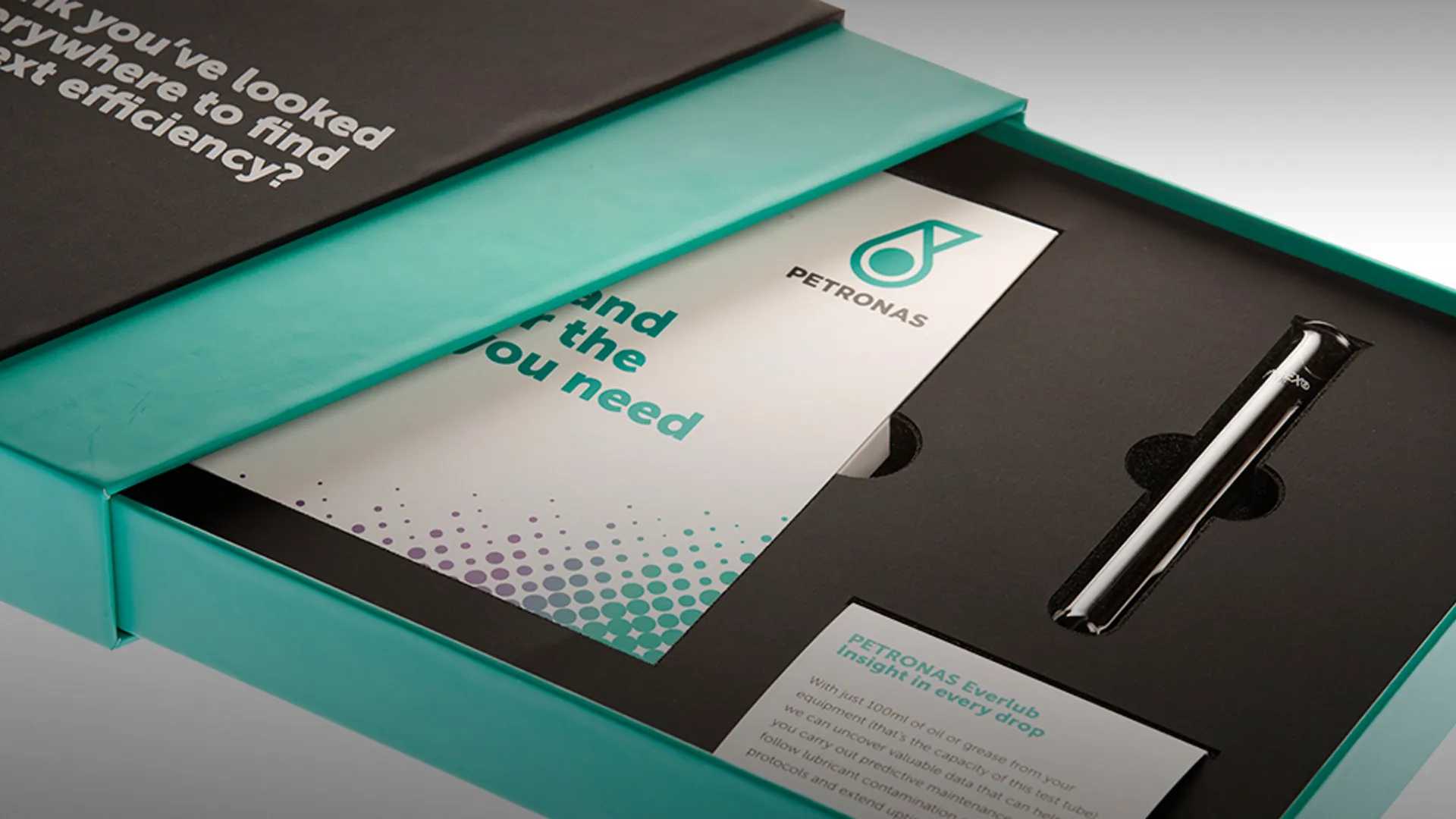
Petronas Industrial Lubricants
Entering a new market with a strategic ABM programme

Panasonic Business
Bringing the hospitality experience to life
Connect
Let's talk.
Want to create something extraordinary? Let’s have a chat. Set up a call with our CEO, Andrew.
Stay informed.
Get our latest thinking on how to maximise brand, GTM, pipeline growth and apply AI, plus our agency updates.