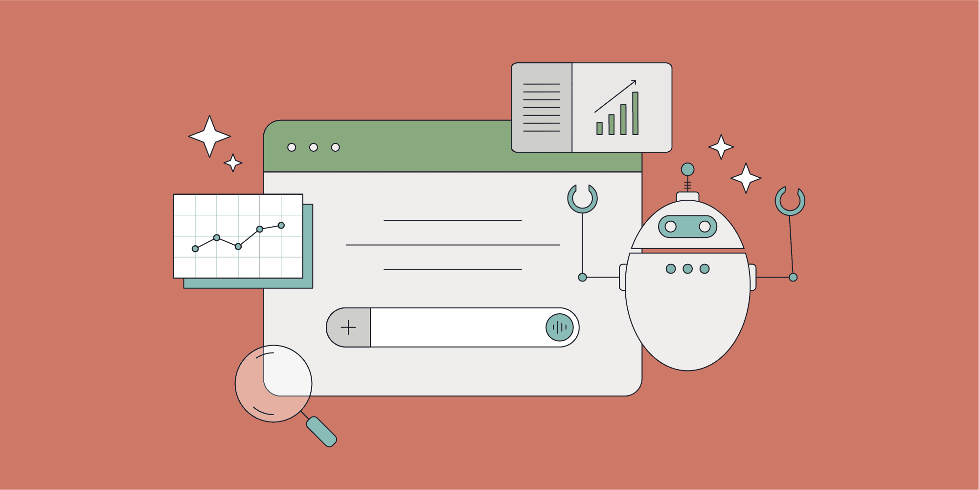
Ideas to inspire growth.
Insights, ideas, and practical guidance.

Latest thinking
What's working right now in B2B marketing.
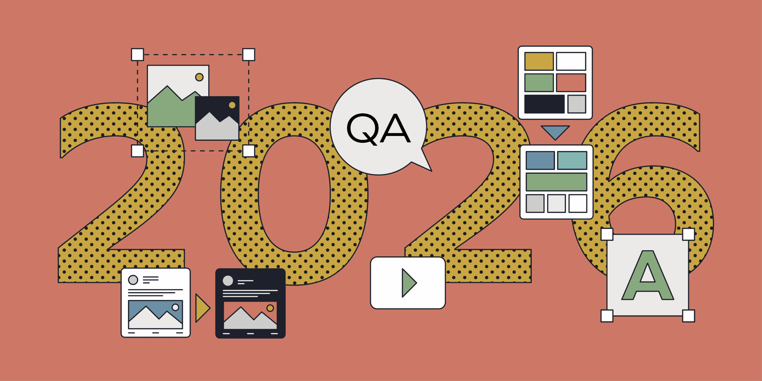
A creative perspective on B2B marketing trends in 2026
Explore our 2026 B2B marketing trends as we embrace AI as a catalyst for deeper insight, stronger creativity, and more effective, human-led brand marketing.
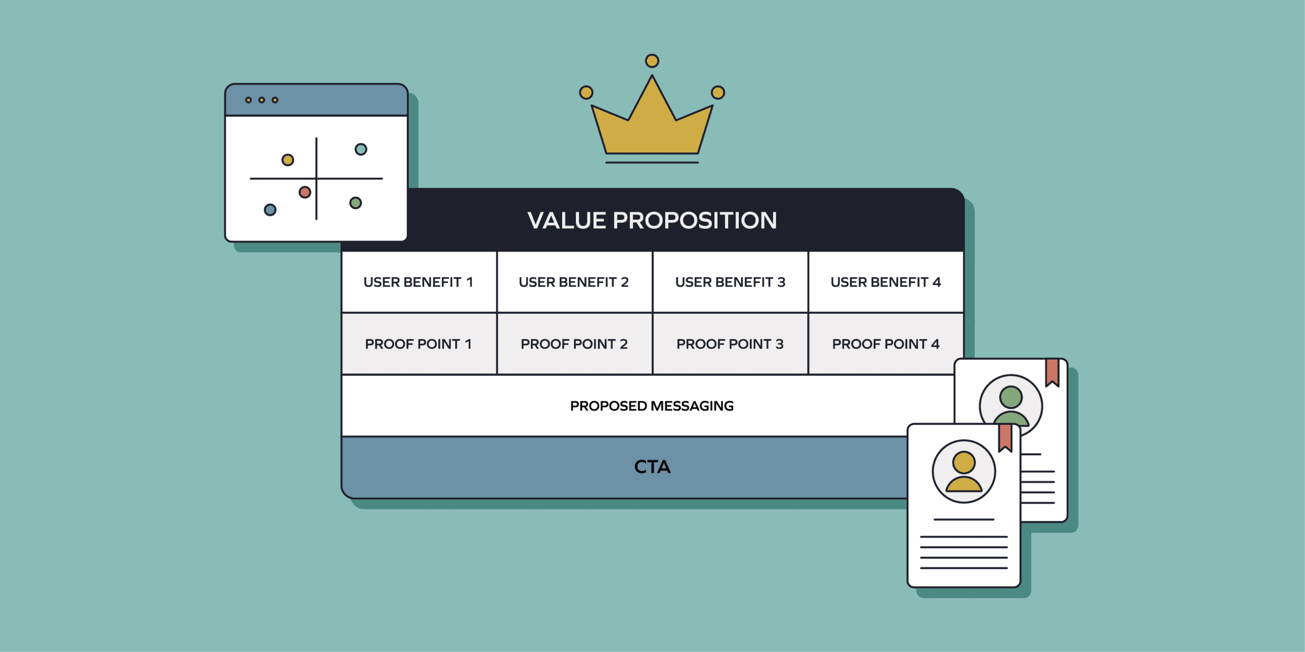
Crafting the perfect B2B go-to-market value proposition
Discover a fool-proof approach to crafting clear, compelling value propositions for complex B2B products.

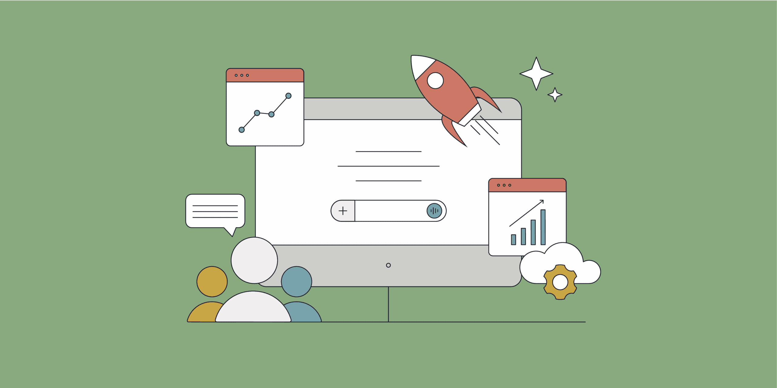
From idea to launch: a step-by-step GTM blueprint for B2B brands
A step-by-step go-to-market blueprint to help B2B brands turn smart thinking into sustainable growth.
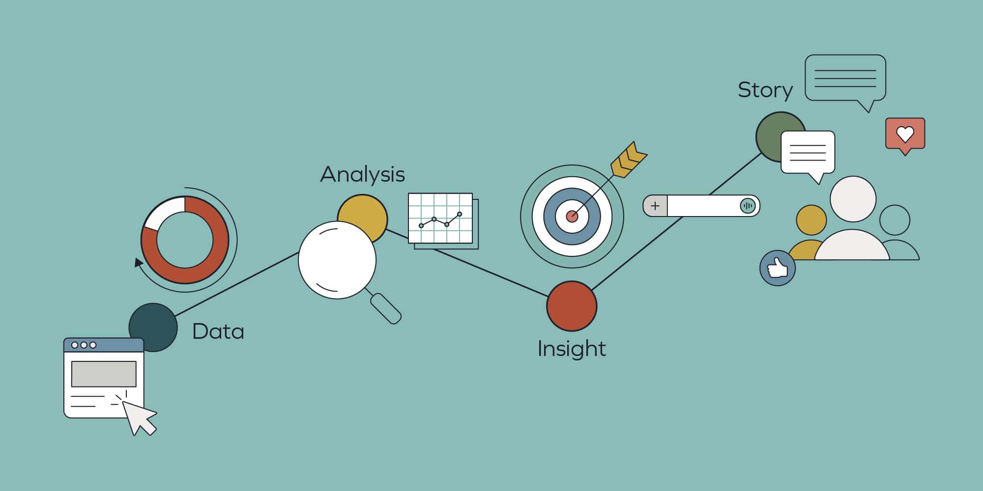
Data-driven storytelling: creating credibility, clarity, and commercial impact
Data is everywhere, but without context it can overwhelm. Discover how data storytelling transforms complex information into persuasive, meaningful narratives.

How to do B2B storytelling: A GTM agency’s guide to content that converts
What is effective B2B storytelling? And how do you make it work for your business? Here's a GTM agency’s guide to content that converts.
How to measure your B2B brand’s AI performance
Discover how to benchmark and track your brand’s AI visibility, sentiment and competitive positioning before implementing GEO strategies.
How to integrate GEO tactics within your existing B2B marketing strategy
As search behaviour changes, learn how GEO helps your brand surface across AI engines and search platforms with simple adjustments to your strategy.
Connect
Let's talk.
Want to create something extraordinary? Let’s have a chat. Set up a call with our CEO, Andrew.
Stay informed.
Get our latest thinking on how to maximise brand, GTM, pipeline growth and apply AI, plus our agency updates.