Secaro

Evolving a DaaS platform’s brand to align with market needs.

Pivotal moment

Adapting a brand for a broader market opportunity.

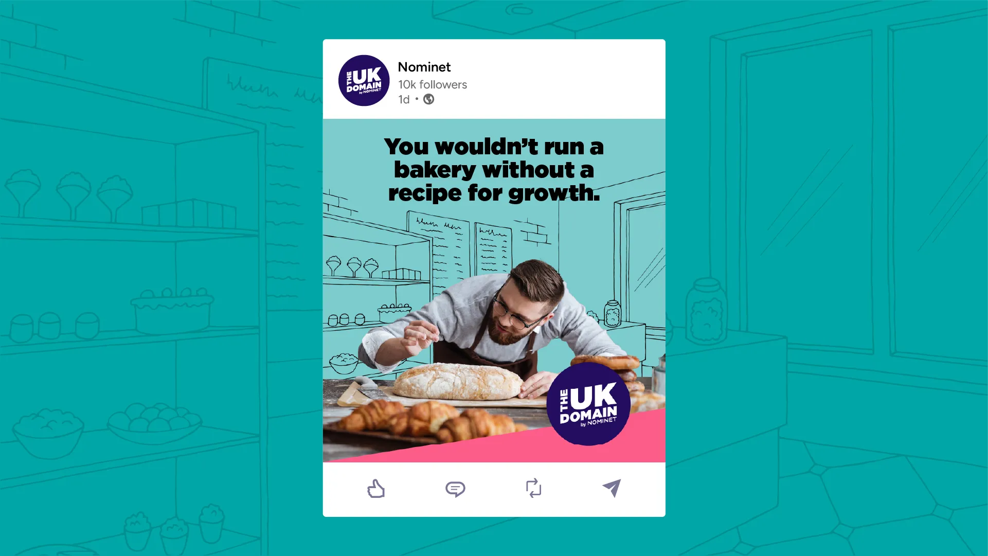
Secaro came to Torpedo at a pivotal point in its evolution. Formerly known as Manufacture 2030, the business had built a powerful SaaS platform to help manufacturers measure and reduce carbon emissions across global supply chains. Originally aligned to the UN’s Sustainable Development Goals 2030, the name and identity had made perfect sense at launch. But with 2030 fast approaching and the platform’s capabilities expanding, its positioning was beginning to limit growth.

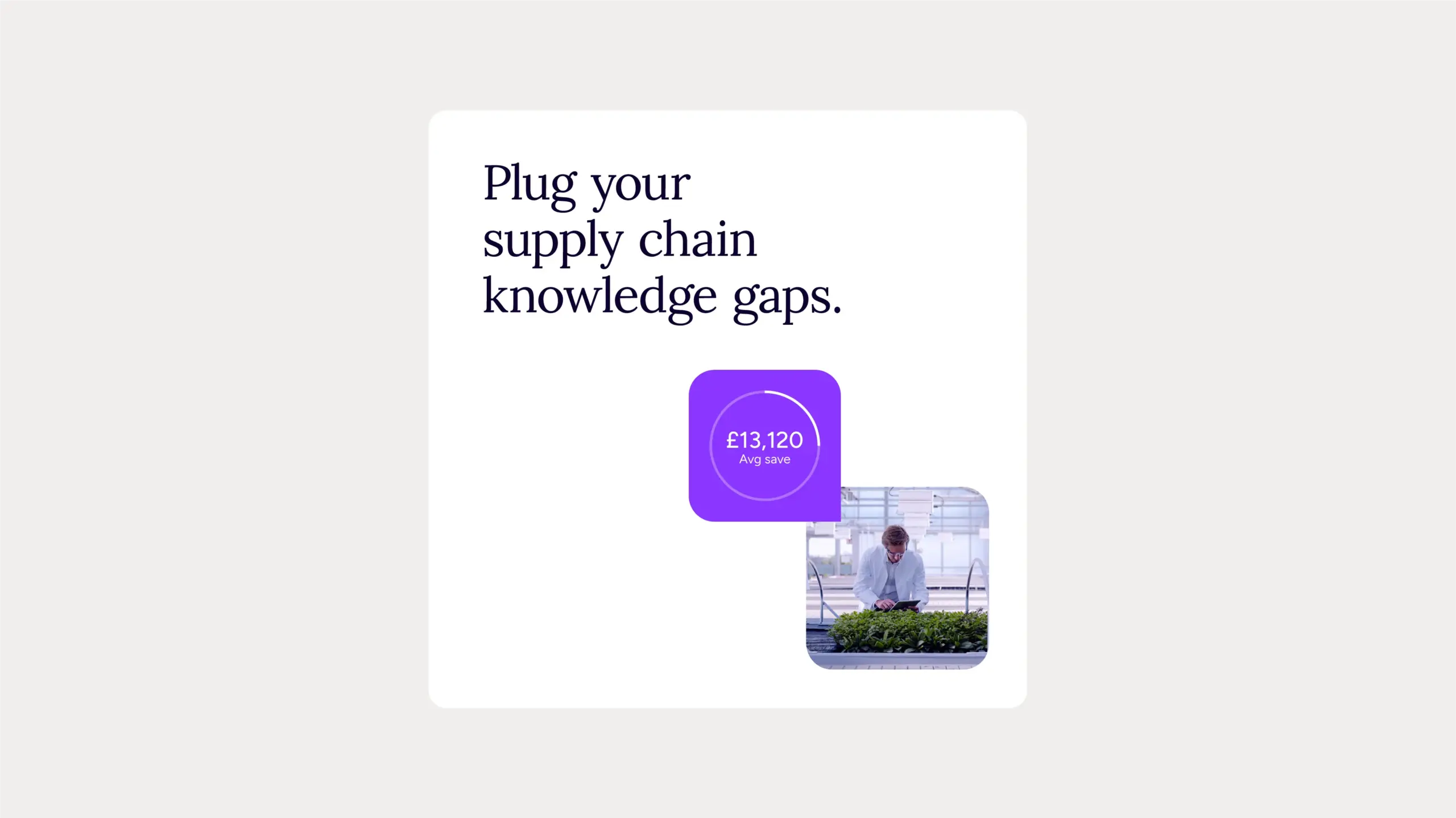
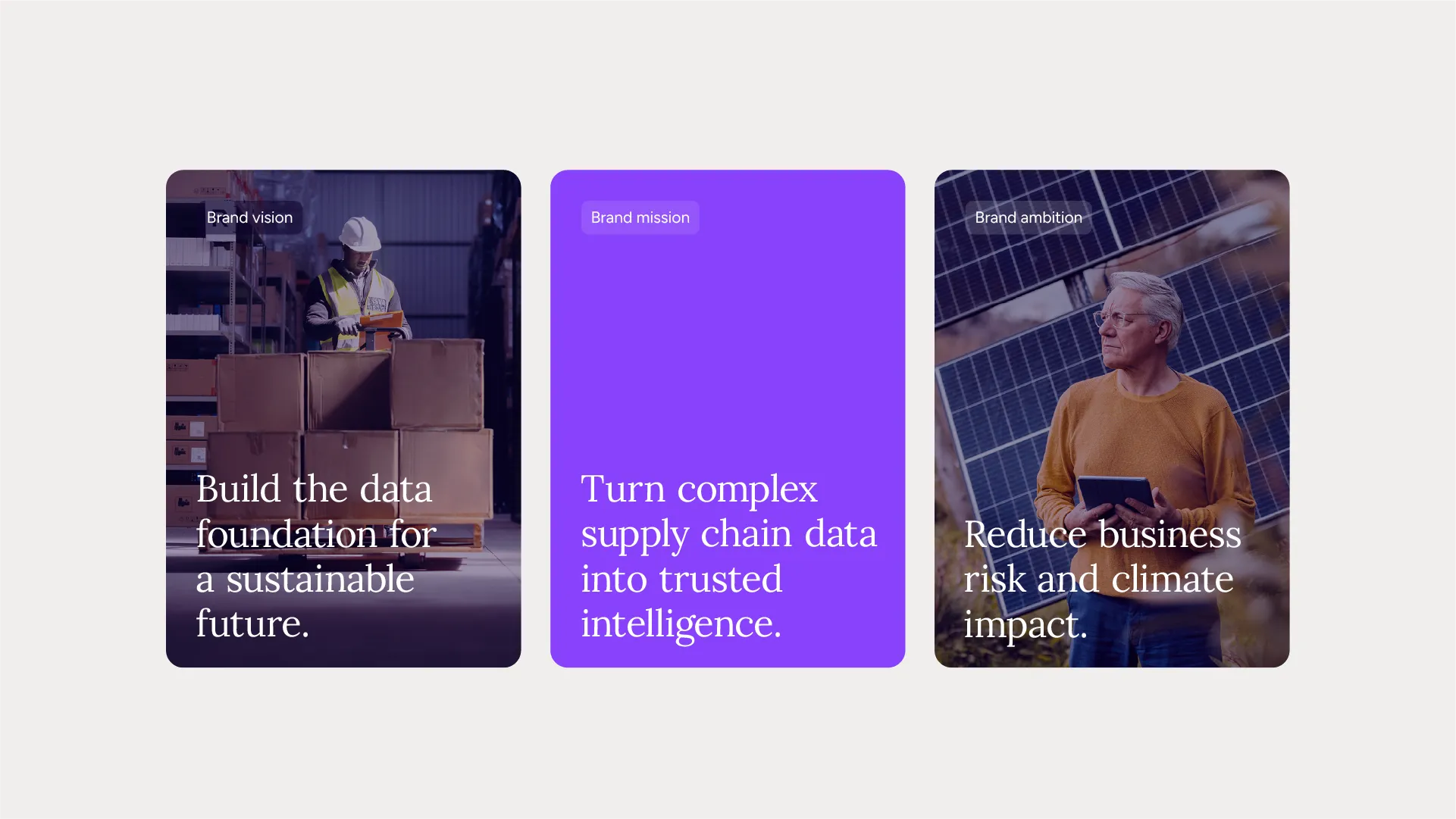
While sustainability remained important, the opportunity was broader. The platform had evolved into a Data as a Service (DaaS) solution, delivering reliable, connected data and enabling collaboration between buyers and suppliers.

As enterprise organisations faced increasing pressure not just to report on fragmented Scope 1, 2, and 3 emissions data, but to prove scalable action, the brand needed to evolve to reflect its true value. The challenge was to redefine how the business showed up in the market – with a new name, narrative, and brand system – built for scale.


Our solution

Rooting the rebrand in business strategy and platform strength.

We began with stakeholder interviews, competitor research, and positioning analysis to understand how the market was shifting. While competitors talked about ‘sustainability intelligence’, our strategy was to take a deliberate step up from that, knowing our client’s platform offered greater value.

This led to a clear, ownable value proposition: unlock supply chain intelligence. From there, we developed benefit pillars, segmented messaging for buyers and suppliers, and a brand narrative designed to resonate with this dual audience.

Getting the right name was a critical part of the rebrand. After exploring numerous options with supporting stylescapes, Secaro was chosen. This coined name was inspired by the Latin seco, meaning ‘to cut’ – capturing the brand’s action focused purpose: cutting emissions, costs, and risk.

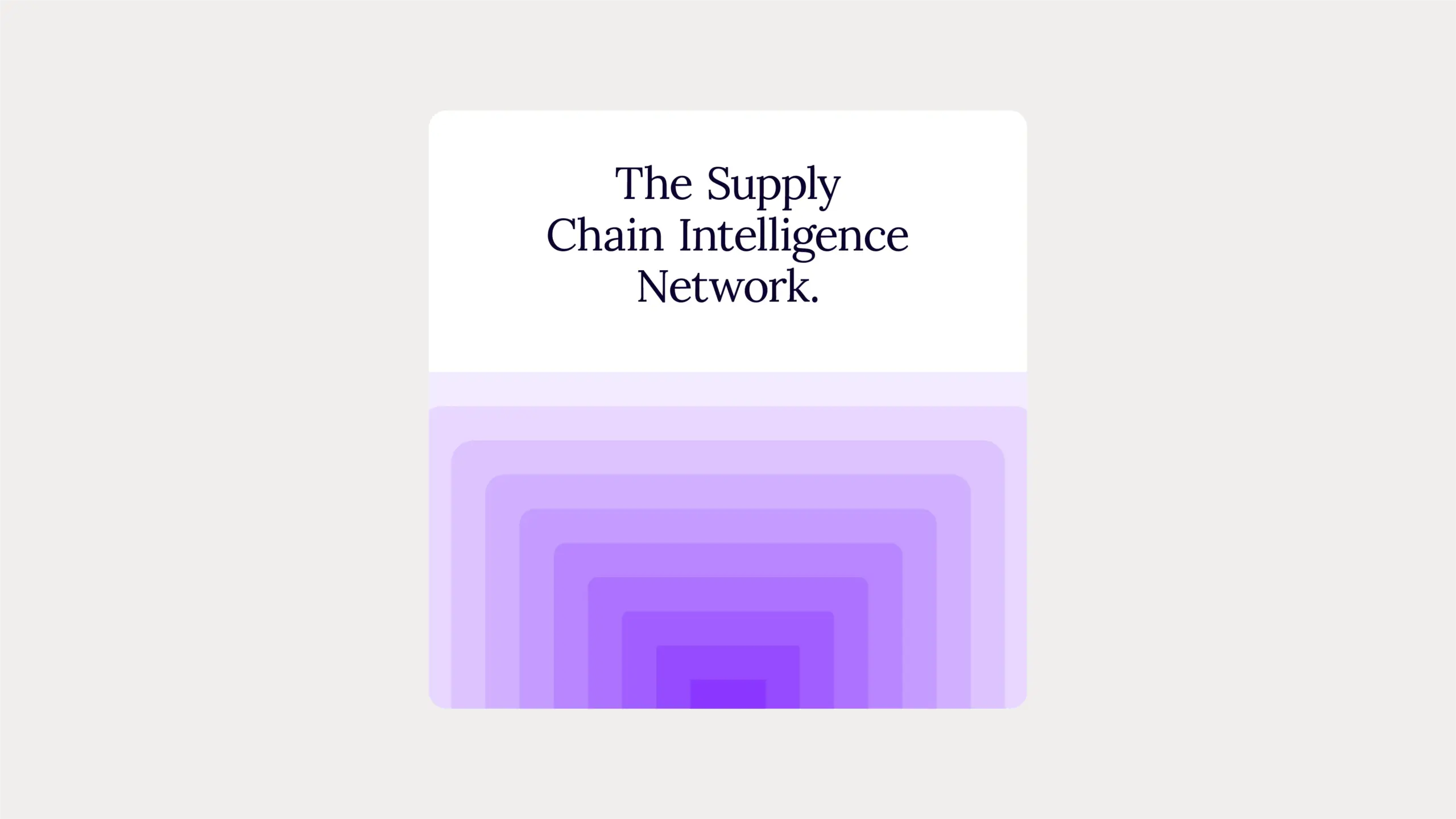
To continue to build the brand’s identity around its platform’s offering, we crafted its positioning statement. This paired the value proposition with the connectivity and collaboration benefits that we knew were key differentiators: Secaro, the Supply Chain Intelligence Network.


Business impact

Establishing a brand ready for enterprise growth.

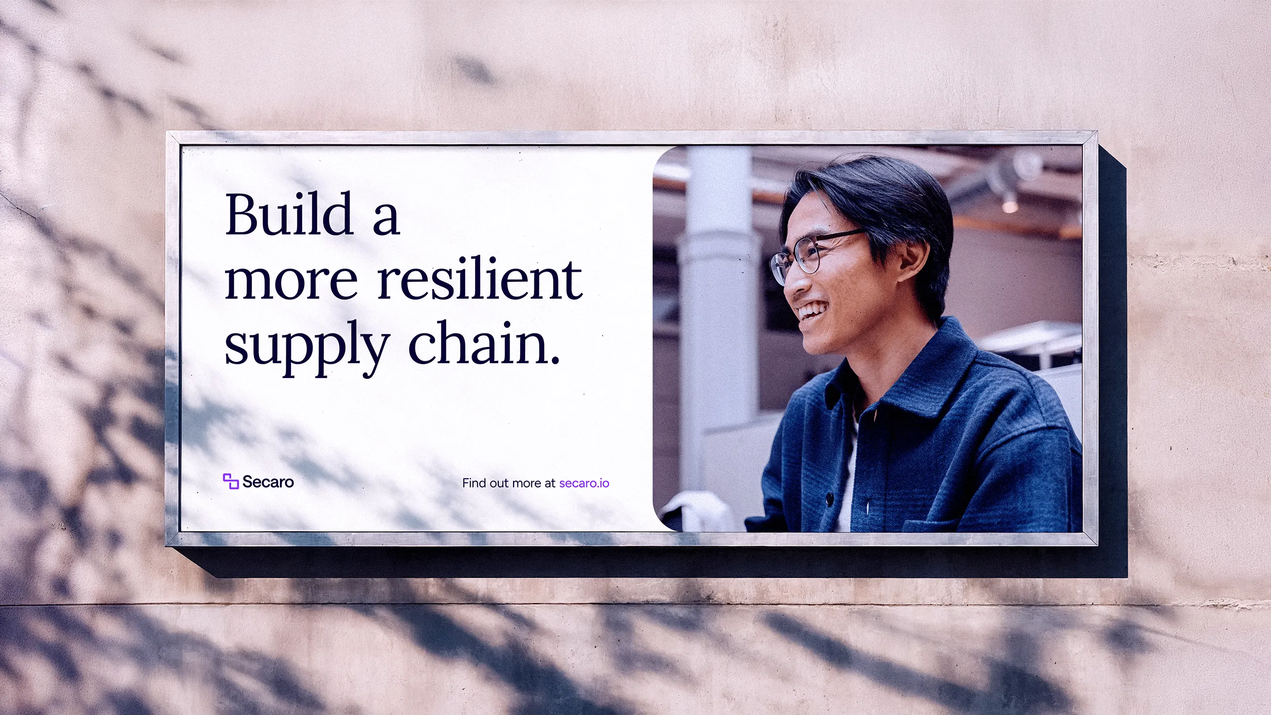
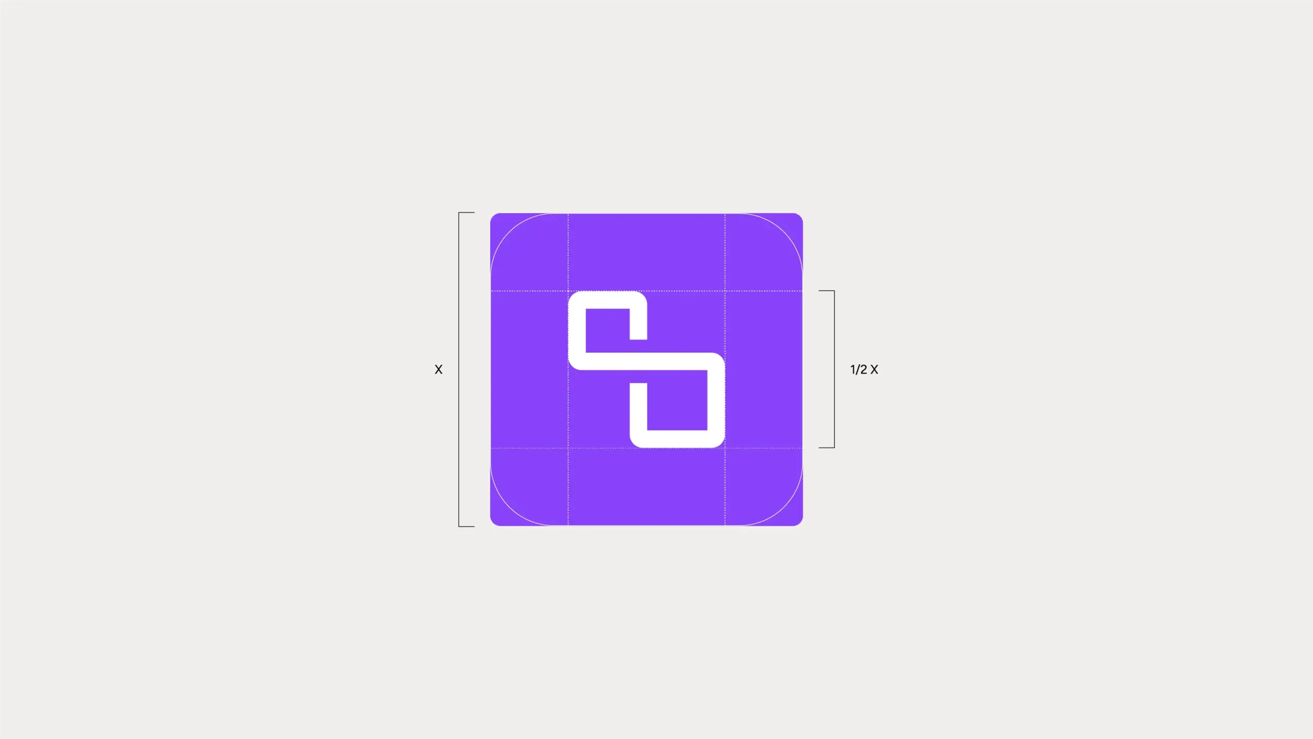
Moving away from clichéd sustainability cues, we selected purple as a bold, distinctive, and future facing core brand colour. The interlinked ‘S’ logo symbolises the platform’s seamless data flow between buyers and suppliers, while the outlined forms and supporting patterns were inspired by the themes of connectivity, collaboration, and incremental impact.

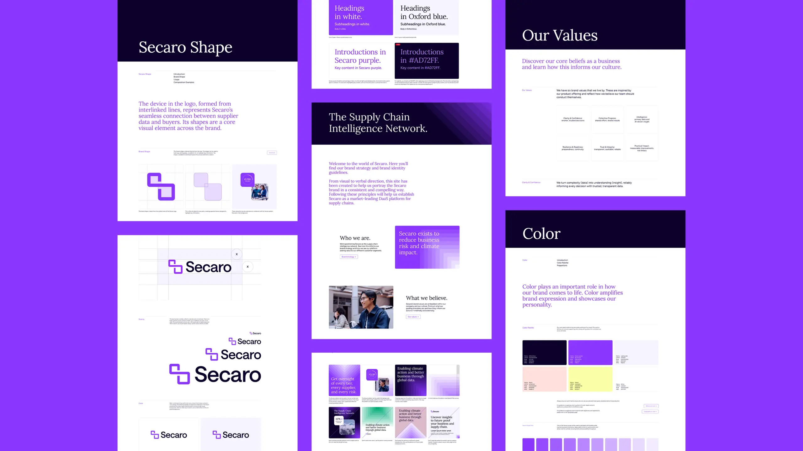
To ensure brand governance and consistency at scale, we created comprehensive brand guidelines. This outlined the brand strategy, detailed the dos and don’ts for design, and explained the tone of voice attributes for copywriting.

This brand project was so much more than a visual refresh. It’s a strategic repositioning that enables Secaro to scale, enter new enterprise conversations, and evolve with its platform’s capabilities and customers’ needs.

Secaro represents a meaningful shift in who we are and the value we create for customers seeking to better understand and reduce emissions risk across their supply chains.
Torpedo helped shape that new identity. They brought strategic direction, creative discipline, and a brand expression that reflects what Secaro stands for: helping organizations turn supply chain data into action.

Marketing Manager
Secaro


Phison

Turning engineering expertise into a standout enterprise brand.

Pivotal moment

Evolving parent brand equity into enterprise presence.

For years, Phison has been the engineering force behind many client-side storage solutions. Its products are well respected, but its brand was largely unknown.

Seeing the growth potential of the enterprise storage market, Phison wanted to take it by storm. As the market is defined by trust, technical credibility, and long-term relationships, the team saw their challenge. They needed to build brand equity – both for Phison and for their new-to-market enterprise brand. And that’s where our strategic partnership began.

The Torpedo team had to consider brand hierarchy and create a new, distinct enterprise brand that still felt like it belonged within the Phison ecosystem. It needed to leverage Phison’s engineering credibility but also hold its own with an impactful visual and verbal identity that would stand out in the crowded SSD category.


Our solution

Building a bold, brand strategy on insight and partnership.

We immersed ourselves within the enterprise landscape – analysing competitors, gathering technical insight, and speaking directly with Phison’s specialists. One thing became clear: while others competed with similar features and specifications, Phison’s real strength lay in deep collaboration, custom engineering, and the ability to solve complex challenges in partnership with their customers. This became the foundation for the new brand’s strategic direction.

We created PASCARI – a name built from the key attributes of Phison’s enterprise solutions: Performance, Acceleration, Security, Capacity, AI, Reliability and Innovation. The identity extended this thinking, with a distinctive “P” device derived from Phison’s established brand asset, the “+”. We used this to express precision, movement, and evolution. A bold yellow colour palette brought energy to this conservative category, giving the brand clear differentiation from day one.


Business impact

Launching an enterprise storage brand that demands attention.

PASCARI has given Phison a clear and compelling enterprise brand presence that resonates with OEMs, hyperscalers, and engineering leaders alike. So much so, that its brand equity is already strong and our clients are looking to leverage this with a website overhaul project – bringing PASCARI into the same parent brand domain.

“I cannot thank you enough for all the work that you’ve done to make this happen – from the start all the way to the finish line. Phison now cannot be unnoticed and will come out of shadows of being a component inside or hidden behind other brand labels, to a brand that has a product which can now be bought directly. This would not have happened without you and your amazing creativity, timelines, flexibility, and tireless dedication!”

Head of Marketing Communications
Phison


Jugo

Humanising digital collaboration through a SaaS brand repositioning.

Pivotal moment

Responding to a global shift towards human connection.

When Jugo (yu-go) approached Torpedo, it had a compelling product vision: to bring stronger human connection to our increasingly virtual ways of working. Unfortunately, its existing brand identity lacked ownability. Sitting within an increasingly crowded landscape of digital collaboration platforms, Jugo wasn’t articulating its true value or how it was different.

Our early brand audit work highlighted key challenges: the visual identity felt generic and the wordmark wasn’t unique. It leaned heavily on overly familiar “connection” tropes. The B2B marketing opportunity wasn’t simply to refine the brand – it was to define a clear strategic position and build an enduring brand identity capable of supporting go-to-market activity, product expansion, and importantly, growth.


Our solution

Shaping a brand identity around meaningful interaction.

We began with discovery – combining stakeholder interviews, market analysis, and a brand audit to define a clear direction. Leveraging these insights, we decided not to position Jugo as ‘just another experiential platform’. Instead, we reframed it as a space where real human interaction could thrive – bringing emotion, authenticity, and meaning to virtual environments. We distilled this down to: Jugo connects people by humanising shared digital experiences. The rest of our strategic positioning flowed from this and we defined three key value pillars: connect, collaborate, and create.


Business impact

Delivering a digital brand for real collaboration.

We wanted to ensure every element of the brand identity was grounded in the strategy. Elevating the brand logo was a priority. With connection being pivotal to both the platform’s capabilities and the user benefits, we built the logo around this – with letterforms engineered to suggest interaction and human connection. The Creative team also opted for a broad colour palette and refined typography. We introduced abstract forms and interaction-led elements to reinforce the idea of connection, while maintaining a clean, minimal aesthetic that supports scalability across digital touchpoints.

The result is a brand system that moves beyond functional collaboration cues. Instead, it brings an emotive, human dimension to digital interaction. Now, Jugo has a clear, differentiated identity and positioning – one that communicates its ambition to make virtual connections feel more real, while providing a strong foundation for campaigns, product extensions, and future growth.

Autodesk Tandem

Bringing clarity to complex digital twin technology.

Pivotal moment

Navigating complexity in the digital twin market.

When Autodesk Tandem was planning to go to market, digital twin technology was a complex concept that wasn’t widely understood by the architecture, engineering, construction, and operations (AECO) sector. The category was growing at pace, but the solutions on the market felt abstract, overly technical, and hard to compare. There was a clear need to educate the target market on what the technology is and the business value of digital twin adoption.

Tandem’s cloud-native platform offers a practical, intuitive way to work with live building data – within the context of an accurate 3D digital replica of the physical asset. The goal was to clearly communicate the real-world value of this and to do it in a way that resonated with time-poor AECO professionals who don’t have the bandwidth to decode complex platform specifications.

For launch, the Tandem team wanted a distinctive positioning and identity, a creative awareness campaign, and a new website with an engaging user experience. Ultimately, the goal was to drive traffic to the website to start building awareness of the brand and educate Tandem’s ICP on the possibilities of digital twin technology.


Our solution

Visualising complex data to accelerate understanding.

Inspired by how Tandem enables building owners and operators to digitally interact with design and construction data, we identified ‘flexible control’ and ‘collaboration’ as the key value drivers for users – putting them at the heart of the brand narrative.

This and our competitor analysis then guided our ideation process. Most competitors seemed to be applying a ‘digital ghosting’ effect to their creative assets, making them all feel very similar. The concept we chose came from the valuable outcome of using Tandem: clarity builds confidence.

With this as our strategic springboard, we developed an original creative system that visualised the modular data blocks of the digital twin solution. These enlarged, cubic pixels contained building design elements and specific types of AECO building data – and became a powerful metaphor for control, organisation, and accessibility. The direction deliberately broke from category norms. Instead of ghostly, translucent visuals, Tandem appeared bold and tangible.


Business impact

Accelerating awareness in a competitive technology category.

All the assets we created for this launch campaign helped to position Tandem as a clear contender. The unique look was instantly recognisable and ownable, while still aligning with Autodesk’s established brand identity.

During the initial campaign window, we had over 70,000 unique visits to the website, signalling significant interest among our AECO audience. More importantly, it helped users quickly understand what Tandem does – and why it matters. With a distinctive visual language and a clear narrative, Autodesk now has a scalable platform for future campaigns – one that makes complex data more digestible, usable, and valuable.

“Torpedo’s holistic approach to brand positioning helped Autodesk Tandem, a new digital twin solution, establish its brand identity and achieve industry recognition. They worked in partnership with our marketing team to create a visual identity and a positive customer experience that solidified our position in the digital twin landscape.”

Senior Marketing Manager
Autodesk Tandem


Hexagon

Shaking up the metrology market with a flagship product launch.

Pivotal moment

Launching a category-defining metrology product.

Hexagon was preparing to introduce MAESTRO – its most advanced stationary CMM to date, designed to transform speed, usability and long-term adaptability. The stakes were high. The product would replace legacy systems responsible for a significant portion of annual revenue, making this one of the most important launches in the company’s history. Success depended on more than awareness. Hexagon needed a clear, compelling go-to-market approach that could align global teams, sharpen positioning and communicate the product’s value with confidence and consistency.


Our solution

Creating a unified story across a complex ecosystem.

We began with deep analysis – interrogating the brief, mapping personas and exploring the competitive landscape to identify clear opportunities for differentiation. From this foundation, we developed a strategic framework built around four core pillars: Faster, Easier, Connected and Growing. These became the backbone of the launch narrative, expressed through the central idea: MAESTRO. Quality Remastered.

With the direction set, we built a fully integrated ecosystem – spanning visual identity, messaging, video concepts, campaign assets and a global playbook to guide regional activation. Every element was designed to work together, giving teams the tools to deliver a consistent and impactful launch across markets.


Business impact

Aligning regions with a cohesive, scalable GTM blueprint.

Our work provided Hexagon with a high-impact foundation for launching MAESTRO globally. Senior stakeholders recognised the creative execution as a step-change in ambition and the visual approach was particularly well received. The messaging framework ensured the complex matrix of features and benefits was tiered. It ensured awareness content was simple and digestible, while conversion content had substance and credible proof points that would resonate with the more technical audiences.

We ran social monitoring to track the general sentiment and response prospects had to the launch. Within the first 10 days, our social media reach was 13,000; our non social media reach was 124,000, and the overall sentiment to the launch was really positive.

Importantly, our programme delivered above and beyond the launch assets – it established a scalable blueprint for future activation, positioning MAESTRO as a leader in connected metrology and setting a new standard for how Hexagon brings products to market.

Autodesk XR

Launching a next-generation design-review tool for the AEC market.

Pivotal moment

Building a GTM strategy for an innovative SaaS platform.

As AR and VR technologies gained traction across the architecture, engineering, and construction (AEC) industry, Autodesk joined forces with The Wild to develop a new extended reality (XR) design review solution.
Created to enable cross-disciplined teams to collaborate inside their 3D models – in real-time – the platform was set to revolutionize the design process and unlock new ways for architects, engineers, and BIM/VDC managers to work together. Being able to experience a building long before breaking ground presented significant commercial value. The friction came from people’s perception of these emerging technologies. The challenge was to prove extended reality isn’t a gaming gimmick, but a credible and compelling tool for architecture design.


Our solution

Defining the product story and user benefits.

We began with focused research, including user interviews, market analysis, and conversations with product specialists. The product was evolving alongside the GTM strategy so we had to work iteratively. To align faster, we hosted a workshop, using this as an opportunity to organise a lot of information and test out a few ideas with the key project stakeholders.
From this, we refined Workshop XR’s points of differentiation and the user benefits. Despite the product’s ‘hero’ features changing in the background, there were a few lead benefits that we kept coming back to: alignment, fluidity, and accessibility.

To refine Workshop XR’s ‘elevator pitch’, we built out persona-specific value propositions and a messaging matrix. There was plenty to say so, the key challenge here was making it as succinct and compelling as possible – based on what we knew our audiences cared most about.
This led to the endline: “Change your perspective. Elevate your understanding.” Both teams felt this distilled the product offering down to why it’s revolutionary (the first-person, human-scale experience) and the value it brings to design reviews (the ability to catch issues, sooner). It was this strategic thinking that informed the subsequent design of the launch website and its narrative flow.


Business impact

Designing an engaging, interactive web experience.

From creating an original, scroll-prompted product introduction on the homepage, to showcasing product UI animations throughout the site, our Strategy, UX, and Creative teams worked together to deliver a user experience that quickly set expectations – this is a next-generation design review tool. It balanced product capability with strong storytelling and always came back to the user benefits.

The finished website successfully showcased both the product and Autodesk’s wider brand – engaging a diverse audience while making complex technology easier to understand. Feedback from the client highlighted its ability to connect with their ICPs: “It beautifully showcases the Autodesk brand and effectively engages our audience of XR enthusiasts as well as BIM Managers, Architects, and Engineers”. Since launch, the platform has continued to receive a positive response, supporting Autodesk’s position and providing a strong foundation for future growth in the market.

“The launch of Workshop XR’s website last Fall was a moment of immense pride for our team, and we owe a great deal of that success to Torpedo. They were instrumental in bringing our vision to life, and we continue to receive positive feedback about the site.

Throughout the long process of writing, designing, and developing the website, Torpedo maintained excellent communication, even when in different time zones. They were responsive to our feedback, promptly addressing any concerns or questions we had.”

Head of Marketing
Autodesk Workshop XR


Autodesk

Reimagining project delivery for a digitally connected world.

Pivotal moment

Simplifying the complexities of modern project delivery.

Autodesk set out to help AECO (architecture, engineering, construction, and operations) teams work more effectively in an increasingly complex environment. Fragmented data, disconnected workflows, and inconsistent collaboration were all impacting project efficiencies – often leading to rework, delays, and cost overruns.

While the concept of Digital Project Delivery (DPD) was set to transform AECO processes, this value hadn’t been communicated clearly. Content needed to move beyond Autodesk’s BIM Collaborate Pro product features and reframe DPD as a strategic, outcome-led approach to project delivery.

Torpedo’s challenge was to simplify DPD’s complex proposition and engage a broad audience. From technical practitioners to senior decision-makers, it was apparent that a GTM messaging framework with audience segmentation would be needed.


Our solution

Transforming industry pain into a compelling campaign narrative.

Our strategy was built on a simple but universal insight: project failures aren’t usually caused by technology, but by human factors such as miscommunication, process gaps, and poor data visibility.

We took this insight and ran with it, transforming it into an original creative platform that made everyday frustrations tangible and emotionally resonant. The concept of “Brian-proofing” was born – personifying the small but costly errors that derail project delivery. From version control chaos to missed deadlines, this springboard enabled us to dramatise familiar pain points, while positioning DPD as the solution that brings clarity, control, and connection.

We then developed this idea and executed a fully integrated digital campaign. For top-of-the-funnel activity, we led with a live-action film. This was supported by social cut-downs with bold messaging. Mid-funnel content tailored the creative idea to speak more directly to the different audience groups. At the bottom of the funnel, we delivered landing pages, emails, and conversion-led display ads – all designed to drive trials and adoption.


Business impact

Accelerating adoption through clarity and connection.

The campaign gave Autodesk a clearer, more compelling platform for Digital Project Delivery – shifting perception from a set of tools to a smarter, connected way of working. By focusing on the outcomes AECO audiences care about most – staying on budget, on schedule, in control, and aligned – the work made a complex proposition both accessible and meaningful.

Beyond measurable impact across the entire funnel., the work established a growth strategy for Autodesk, and this is now being adopted across other product teams. In redefining how Digital Project Delivery is understood and communicated, Autodesk is now far better positioned to lead the industry – helping project teams work more confidently in a digitally connected world.

“This was one of the coolest Autodesk pieces we’ve seen. It’s both on brand and unique – engaging and informative.”

Senior Campaign Development Manager
Autodesk


Nominet

A go-to-market campaign that meant business.

Pivotal moment

Reigniting demand for a national domain brand.

Nominet wanted to strengthen the position of the .uk domain in a market dominated by .com.

While millions of domains were already in use, growth had slowed – and many SMEs weren’t fully aware of the benefits a national domain could bring. The challenge was to shift perception, encouraging businesses to see .uk as a credible, valuable and relevant choice. The campaign needed to test and learn quickly, delivering short-term impact while uncovering insights for longer-term growth.


Our solution

Connecting the campaign to real business motivations.

We explored the behaviours and priorities of UK SMEs, identifying a key barrier: many businesses didn’t see the direct value of investing in their domain presence. Our approach focused on making that value tangible. Messaging highlighted trust, credibility and professionalism – qualities strongly associated with .uk, but often overlooked. Creative execution leaned into a confident, distinctly British tone, combining relatability with purpose. The narrative was human and authentic. Media strategy prioritised testing – refining messaging, channels and audience segments to identify what delivered the strongest response.


Business impact

Shifting brand perception across the UK SME market.

The campaign drove a clear uplift in both awareness and perception. Traffic increased significantly, and metrics showed strong improvements in credibility, trust and familiarity among target audiences. These results provided the evidence needed to move beyond testing into a more sustained strategy. Recognition followed too, with the work earning industry accolades and establishing a clear model for future campaigns.

“Our UK domain awareness campaign was a great success! Torpedo’s data-driven strategy not only enabled us to pinpoint and engage the audience segments that had the most potential, but also to develop an intelligent creative strategy that tapped into human psychology and drove home our core propositions in a powerful and actionable way. Our carefully selected mix of channels and tactics taught us valuable lessons for driving long-term impact, and the short-term results also delivered beyond our expectations in generating awareness and persuading the hearts and minds of our SME audience that a UK domain is a no-brainer for their business.”

Head of Marketing
Nominet