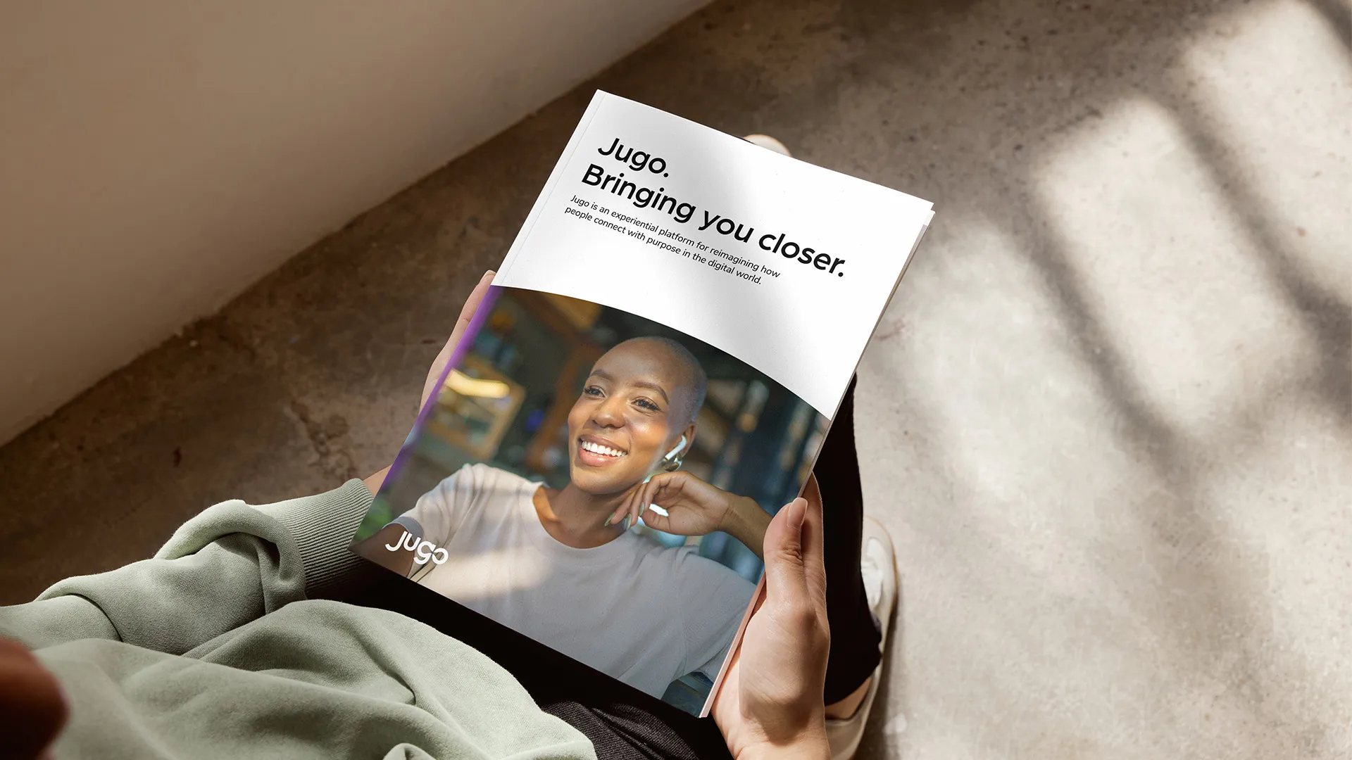
Jugo
Humanising digital collaboration through a SaaS brand repositioning.
Pivotal moment
Responding to a global shift towards human connection.
When Jugo (yu-go) approached Torpedo, it had a compelling product vision: to bring stronger human connection to our increasingly virtual ways of working. Unfortunately, its existing brand identity lacked ownability. Sitting within an increasingly crowded landscape of digital collaboration platforms, Jugo wasn’t articulating its true value or how it was different.
Our early brand audit work highlighted key challenges: the visual identity felt generic and the wordmark wasn’t unique. It leaned heavily on overly familiar “connection” tropes. The B2B marketing opportunity wasn’t simply to refine the brand – it was to define a clear strategic position and build an enduring brand identity capable of supporting go-to-market activity, product expansion, and importantly, growth.
Our solution
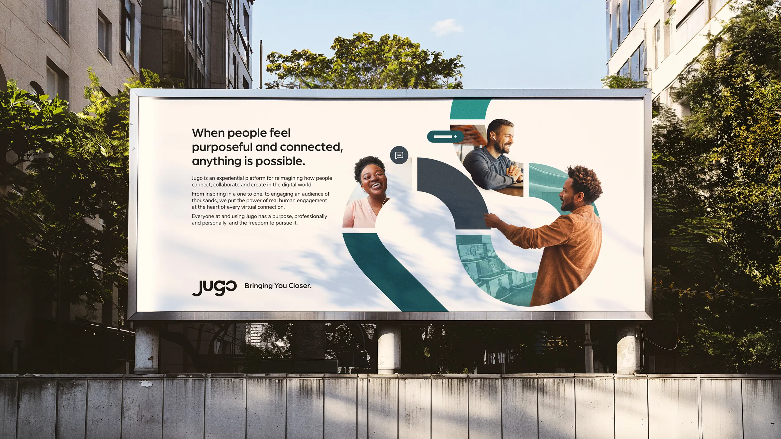
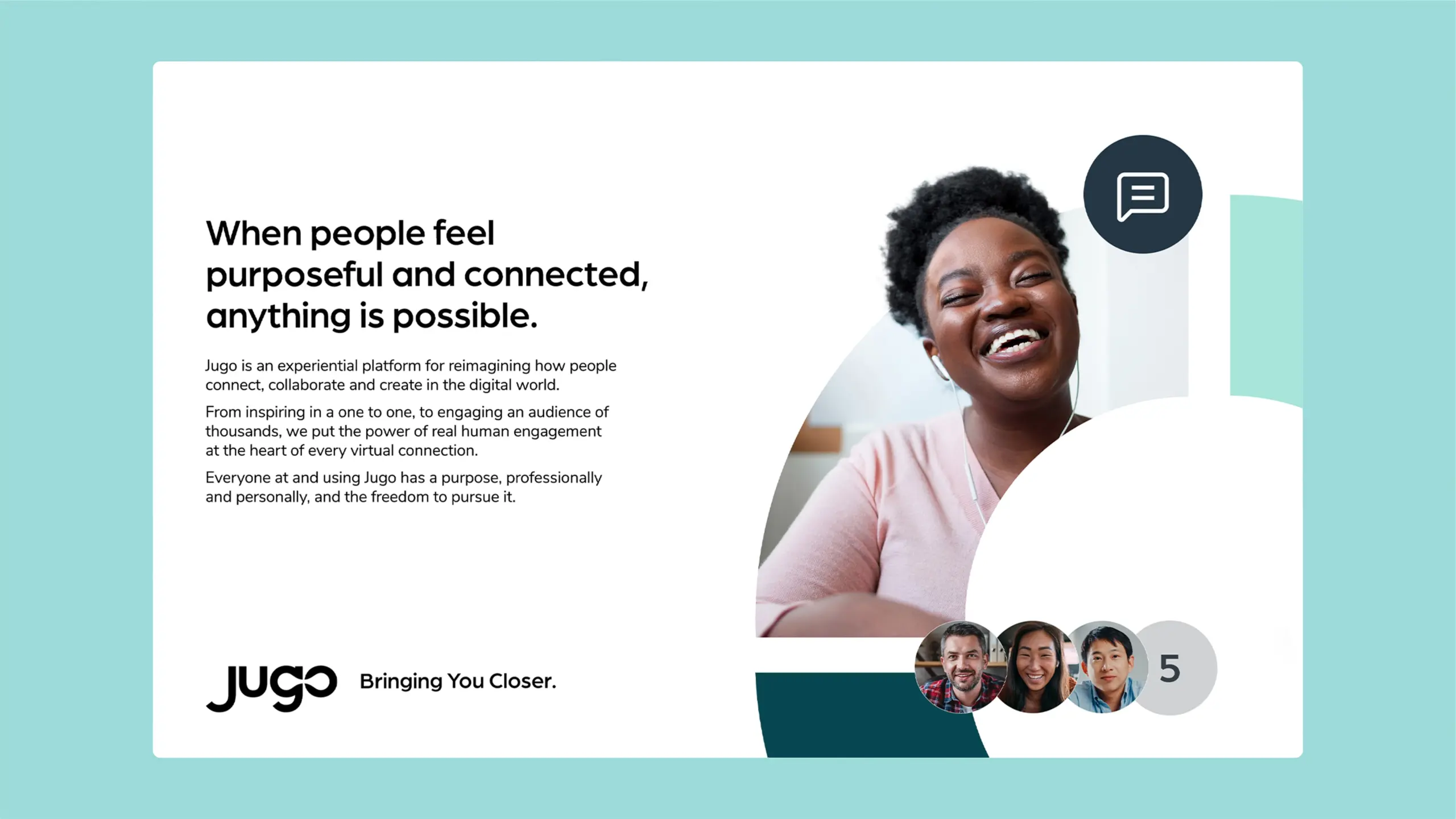
Shaping a brand identity around meaningful interaction.
We began with discovery – combining stakeholder interviews, market analysis, and a brand audit to define a clear direction. Leveraging these insights, we decided not to position Jugo as ‘just another experiential platform’. Instead, we reframed it as a space where real human interaction could thrive – bringing emotion, authenticity, and meaning to virtual environments. We distilled this down to: Jugo connects people by humanising shared digital experiences. The rest of our strategic positioning flowed from this and we defined three key value pillars: connect, collaborate, and create.
Business impact
Delivering a digital brand for real collaboration.
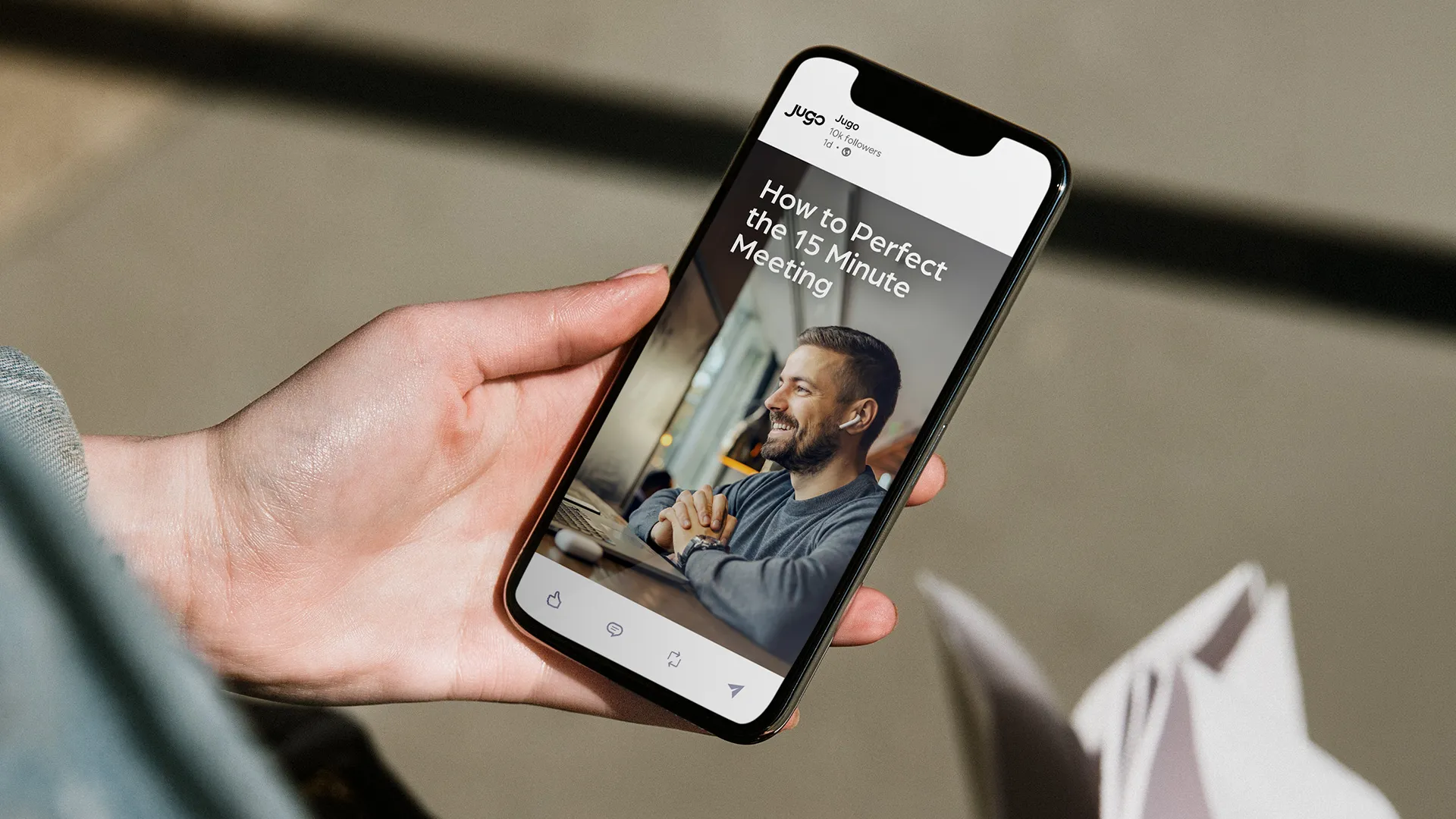
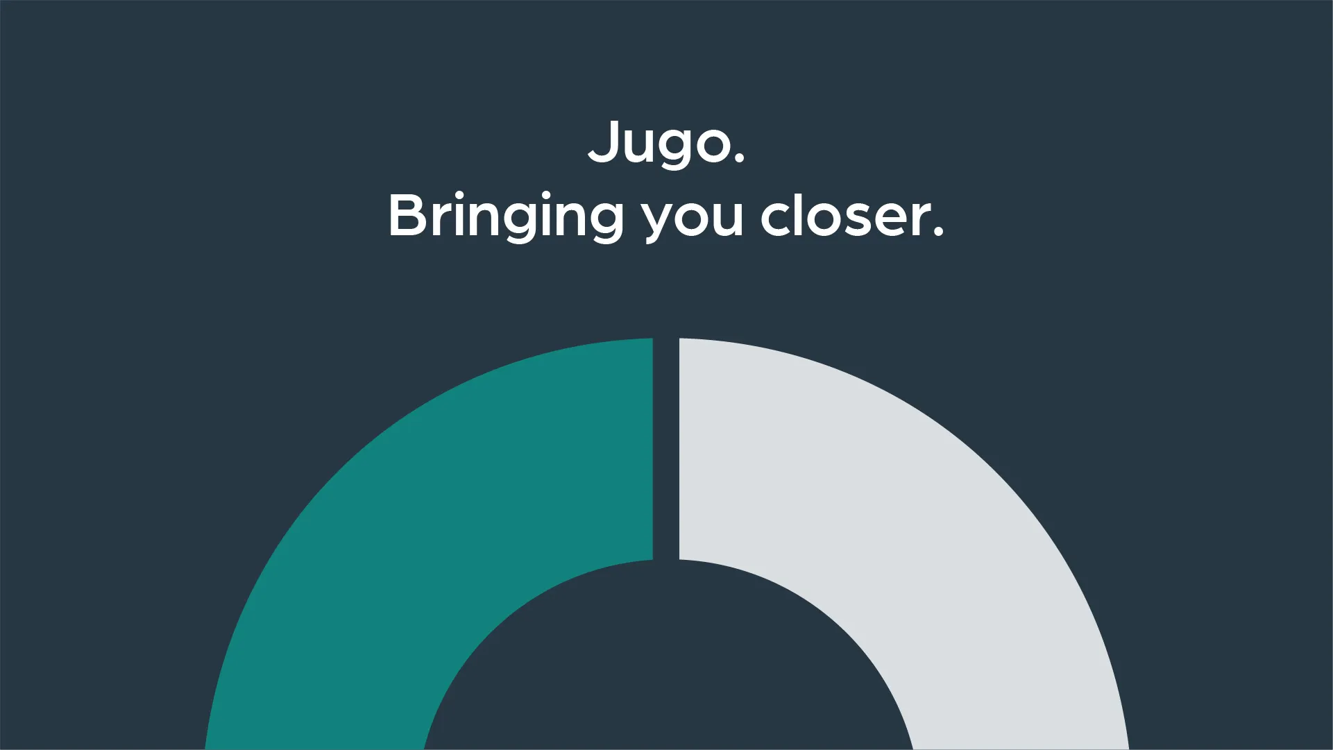
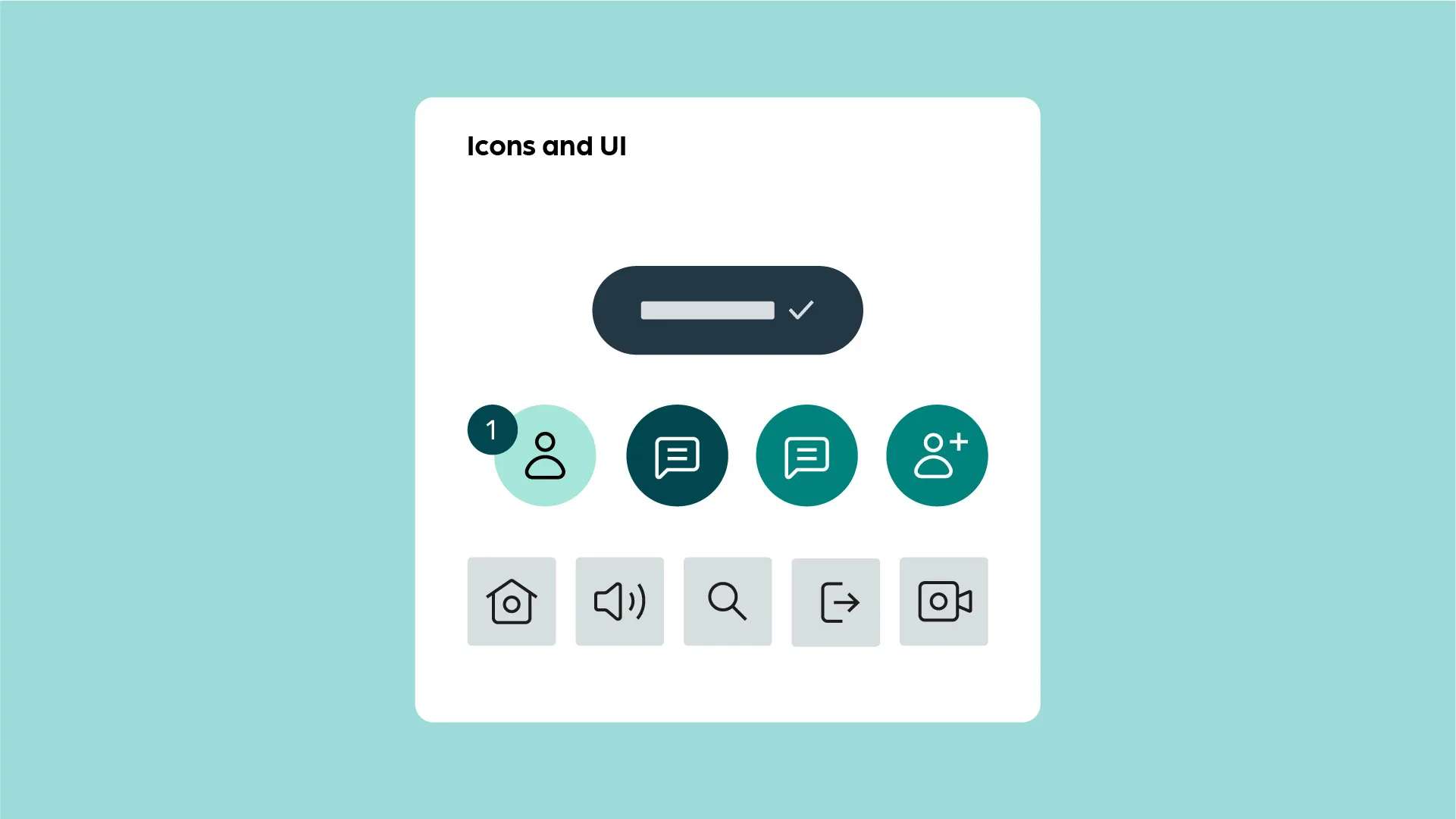
We wanted to ensure every element of the brand identity was grounded in the strategy. Elevating the brand logo was a priority. With connection being pivotal to both the platform’s capabilities and the user benefits, we built the logo around this – with letterforms engineered to suggest interaction and human connection. The Creative team also opted for a broad colour palette and refined typography. We introduced abstract forms and interaction-led elements to reinforce the idea of connection, while maintaining a clean, minimal aesthetic that supports scalability across digital touchpoints.
The result is a brand system that moves beyond functional collaboration cues. Instead, it brings an emotive, human dimension to digital interaction. Now, Jugo has a clear, differentiated identity and positioning – one that communicates its ambition to make virtual connections feel more real, while providing a strong foundation for campaigns, product extensions, and future growth.

Impact
More for you
Connect
Let's talk.
Want to create something extraordinary? Let’s have a chat. Set up a call with our CEO, Andrew.
Stay informed.
Get our latest thinking on how to maximise brand, GTM, pipeline growth and apply AI, plus our agency updates.